The Dressing Room 3
by LloydCreative • Uploaded: Mar. 25 '10 - Gallerized: Mar. '10
Description:
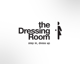
Logo option for a new women's clothing store.
Status:
Nothing set
Viewed:
28837
Share:




Lets Discuss
LOVE THIS ONE! Well done!
Reply%5Eagree, but I'm not sure about typo %3E looks unfinished.
ReplyThanks Alen - you're quick off the mark! Client was leaning towards this one at the presentation today. Will see what they decide.
Replycool mark!! **I'm with bigoodis about the typography. Step in, dress up is also a little bit to far away from the name.
ReplyWhen I click on 'view all' if I like something I'll point it out immediately! :) I like the typography, maybe just a tad more space between the rows, tag line is on it's place, mark rocks! Love it!
ReplyThanks Ivan and Alex... I was wanting to achieve a very utilitarian, almost public service, wayfinding signage feel so the use of Helvetica was a given for me. I was happy with the balance and composition.. didn't want the tagline to sit too near the name - I guess, given it's early stages though, there's always room for improvement. Thanks for the opinions though - much appreciated.
ReplyYou guys are on the case today. I see the areas you are referring to Ivan, but I actually am a bit of a fan of overtight leading in the right place. Guess it all comes down to personal preference - what someone sees as too close, someone else sees as cozy. I'm a cozy kind of guy. And I guess placing the tagline a little further away acts as a kind of visual counter balance - the meeting of two extremes in a line spacing sense. *By the way - is anyone else getting these comments pages loading all out of whack in Safari? They load fine in Firefox but not in Safari.
Replysweet...:) i wana peep in:)
ReplyI think it is amazing that you have managed to represent the door in such a minimal way. Great concept, love the logo.
Reply%5E How come it's in the gallery then David? (that's a honest question, I'm not having a go)
ReplyI think you might want to be careful with this concept, cause to me it looks like a restroom's door instead. As that female figure there is widely seen outside a restroom... so I'd suggest to illustrate it in a different fashion.
Reply%5E%5E%5Eagree wid kath...the illy used for the mark is so commonly related to a rest room, thats what comes to ur (atleast mine), head, at the first look. If you remove the typeface and put 'HER', the logo works better or maybe people are used to that imagery and concept...but i still dig this for the concept, not the xcecution...:)
ReplyAgree...great design but feel far too utilitarian for fashion. But, depends on the client.
Reply@nitish... is that why you wanted to peep in? just kidding...
Replythats cool David just wondering
ReplyHey - thanks for all the interest folks. Nice to have some varying opinions on the work. Better that than having a design that no-one has anything to say about. I guess for me, a logo has to do more than just be a literal visual metaphor for a certain industry - that can be important - but there's also the need to be memorable, instantly recognisable, and have the all important cut through. I agree, the market is crammed with clothing retailers, so for me, having a logo that 'fits' in with the rest of them is perhaps not always the way to go. I want people to take a second glance, give people a reason to remember and if using a style that is at odds with the rest of my client's competition, then maybe that the route to take. Ultimately, it will be the client who makes the call - and given that I have presented a variety of options, they are getting a range of concepts that cover a few different points of view on how their brand can be best marketed. Like they say, variety is the spice of life.
ReplyThis is good BigAl. A fashion design logo doesn't need to have a certain form to it, it can be absolutely anything you want it to be. Yes most have the same style but definitely not all of them. There isn't a right way or wrong way to design a fashion logo.
ReplyI see a peeping Tom.
ReplyNice way to handle it Big AL?
Reply? mark slipped in there.
Replyto me the tight leading looks necessary to make the left edge of the door. **Looks great!
ReplyThanks Dan... glad you see a logic in the composition. Appreciate the float and comment.
Replylovely mark
ReplyThanks for looking in Bronte and Thomas.
Replygreat idea!
ReplyThanks Tomec.
ReplyLooks nice!
ReplyWell made.
Replyawesome
ReplyPlease login/signup to make a comment, registration is easy