GRAMYA v03
by sbj • Uploaded: Mar. 25 '10
Description:
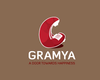
logo for NGO working for education n empowerment of women in villages, here in India.
comments welcome
font updated..
Status:
Unused proposal
Viewed:
3897
Share:


Lets Discuss
weird tag line...but nice illy
Replylove your mark
Replythanks guys*@nitish this version has original clients line.. other version hav mine line for pond... :)*
Replysbj, on the thumb, I thought it's some strange animal's mouth opened... But up close, I find the mark very pretty and elegant. Like it a lot. Maybe a replace the white with something tinted? Or a different treatment with the red?
Replylol!*thanks kath for cuming till here... i will sure try ur suggestions..
Reply%5E%5E%5Ekath and sbj...i ges the representation of the mark is very much groundered in the rural indian look..so sorabh i dont think u need to change anythin...rather work on the type to make it more rural...imo
Replythis new type fits better IMO, but do you think it may look better if R isn't stepping on A's toe?**btw, I actually love that rich red (my recent fav.) I just can't help but seeing the white profile as some animal's sparkling white teeth....
ReplyI like the illustration a lot! I did have to look twice though, to see that it's not a mouth with teeth and tongue sticking out.
ReplyLove the mark but I'm not sold on using Diavlo. Given the curviness of the illustration, a more rounder typeface would fit, IMO
Replythanks skeermes n sawan..*yess it might be more clear concept for people who know India well %26 it for an Indian NGO.*%26 sawan- its still not final yet they r not responded yet.. i will change it for sure :)
ReplyPlease login/signup to make a comment, registration is easy