pizza samurai v03
by sbj • Uploaded: Mar. 24 '10
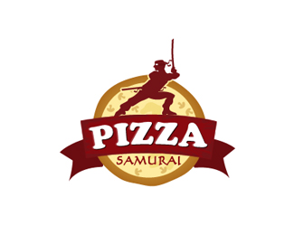
Description:
concept direction ends here.
all on client.
personally looking for more ways but still i like this.
comments r welcome..
Status:
Unused proposal
Viewed:
4371
Share:


Lets Discuss
nice development...keep up the good work....for me the b.g pizza is still not tr yet and the type samurai is too week...all da best bro...keep developing.:)
Replyhey niti thanks yaar... those point r still bugging me here that's why im looking 4 sum other solution to it.
Replynice concept. coming along nicely with the subtle changes. :)
Replythanks mike..
ReplyI like it, but it looks more like a ninja%3C%3C
Replyi like
ReplyActually I do like this very much...but I just feel that you need more shadow on the ribbon so we can see the dimension....more contrast probably ! no offense just sharing my thought :)
Replythanks guys, no problem dear .. m always open for feedback..
Replyvery nice concept ... but as a real samurai I have to say ... this one looks a little bit like a pirat ... ... never seen a samurai with trousers and boots ... when i'm out playing with my katana i wear a hakama ...
ReplyThanks Bernd, yess ur right but i think since start i don't want to make it look lyk actual samurai.. :)
ReplyPlease login/signup to make a comment, registration is easy