Tincau Nicolae
by dotflo • Uploaded: Mar. 18 '10 - Gallerized: Mar. '10
Description:
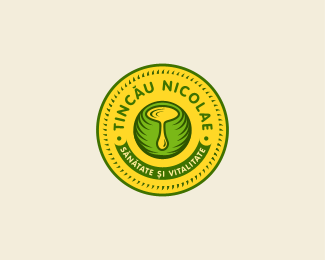
final logo, for Tincau Nicolae, a company involved in the cooking oil industry; The client decided to go with a little bit more retro look, they want to brand themselves as a company that makes a natural product, "like they used to do it in the old days" in a healthy way. The central symbol represent a bowl and the oil that's dripping out creates the letter T, the owners last name initial.
Status:
Client work
Viewed:
20933
Tags:
illustrated
•
illustration
Share:

Lets Discuss
I'm impressed by what I see here.
Reply%5EMe too. Very nice work.
ReplyI'm stunned, looks very cool. Had a very similar brief just recently, wish i had done as well as this.
ReplyNice finish. Faved, etc.
Replythanks a lot guys
ReplyThat is brilliant, mate, really good work
ReplyThis is really nice man!
ReplyI like it a lot, Capota, nice job my man.
ReplyIt is good.
ReplyGreat work, I think you achieved what they wanted! Do you have the chance to do the packaging as well?
ReplyIt is good.%0D*
ReplyI keep seeing an open mouth with uvula. Can't bet passed it. Maybe if the drop were more tear drop shaped. Dunno.
Replyi must agree with glenn here... that was my first impression also... but nice design anyway...
Reply%5E Good point, I saw that too. Thinning out the top of the drip would give it the tear drop shape.
ReplyThanks for the suggestion guys, will try to take care of that problem*@Alex, this is the company logo for now, but i will work on the product logo and packaging also*
Reply%5E%5E%5E agree with the suggestions above. I saw the uvula first also.*suggestions on how to fix it sound good. But I love the concept a lot. nice feel to it. like the retro home based look.*
Replycolors are sweeet
Replyupdated, with the drop thinner:) thanks for the suggestions guys
Replyvery nice mark dotflo!
ReplyTurned out brilliantly! Great work! :)
ReplyNice....!
Replynice color! nice mark!
ReplyYou've got my vote, this is a fantastically original logo. I'm sure your client will use this for years to come, great work!
Replysimply elegant and tasty
Replythank you all for the support ,*@archaxis, indeed the client is very happy with how it turned out
ReplyNice work....but the spelling Heatlh???
Reply%5E yay %3B) good eye :)
Replyi guess i was tired shakeyjakey :), anyway that tagline will be a different one, the client is still working on it
ReplyNo worries! Good job - nice balance and colours.
ReplyGreat logo, I love the retro influence to the design. I think you have a really nice design style.
Replythis is quite an impressive design, great line treatment and color chemistry. lookin' forward to see it on a actual product, i'll sure buy it for the logo B)
Replycheers guys, *@ logo design monster, thanks a lot mate*@lecart, ms mult :)) i hope the client will come soon with the name for the product,
Replyfloated! nice traditional badge style logo - like the pot in the middle too.
ReplyDon't know how I missed this one, really great looking.
Replysame as joe :) instant fav!
ReplyNice! nice collor
Replyvery nice!
Replysupreme!
ReplyMissed this beauty! Wow! Please keep us updated on the packaging!
Replythanks a bunch my friends, @bilebo, i sure will, just that business is running low these days, and the client put this on hold unfortunately.
ReplyI love the concept a lot, nice feel to it. Like the retro home based look and nice balance of coloursa
Replymissed this, nice job.
ReplyMissed it too, awesome. awesome. awesome
ReplyLove the emblem and its color. Great work!
Replymany thanks
ReplyLove the colors they give it a natural earthy look, very nice design.
ReplyVery nice Florin. Come on people, let's get this over 100!
Replylol Simon, you indeed are a funny man*PS. listen to him people :))
ReplyI would vote twice, if there was an option like that.
Replyhaha, cheers buddy
ReplyWell I tried. :0 Nice work.
Replyhehe just realized this got 100 floats, thanks everybody!*@Simon, I guess special thanks to you lol
ReplyVery Very nice work.
Replycheers antonio
ReplyNice work!!!
ReplyThanks Nandy!
ReplyThe colors fit so well :)
ReplyPlease login/signup to make a comment, registration is easy