AURI Footwear
by DanielBeaton • Uploaded: Mar. 12 '10 - Gallerized: Mar. '10
Description:
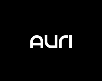
Logo revamp for the footwear company based in Southern California. Custom type.
Status:
Client work
Viewed:
12458
Share:


Lets Discuss
I like it, sweet type!
ReplyThis is really clean and tidy. Well done.
ReplyDid you try making the A out of U shape flipped around to make it more interesting and compatible with the rest?
Reply%5Egreat suggestion.
ReplyThanks for the comments and the suggestions. Jerron I did try making the A out of the U shape and we almost went in that direction but felt it was too big of a departure from their older logo.
ReplySo simple and beautiful :-)
Replytoo simple... nothing in it for me!
Reply%5E Yeah, needs a gradient... lol
ReplyI disagree jonnyd - There's something to be said for something SO simple that can catch your eye and draw you in like this one does. It's great.
Replythe %22u%22 look a bit bigger? It simple and clean :), but it does look like existing font type that been using, not sure , just my opinion.
Reply@Tabithakristen... Sure it's ok as a piece of 'type' but not a gallery piece.
ReplyPlease login/signup to make a comment, registration is easy