Vala Developments
by koodoz • Uploaded: Mar. 08 '10 - Gallerized: Mar. '10
Description:
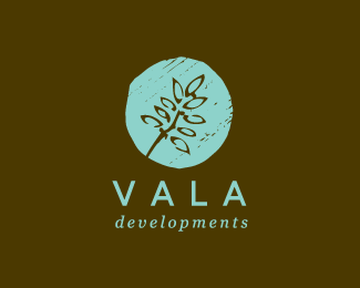
Approved logo for Vala Developments - a Property Developer with an eco-friendly and sustainable future ethos.
As seen on:
Koodoz Design
Status:
Client work
Viewed:
19405
Share:
Lets Discuss
nice mark here
Reply@dotflo - Thanks. I think this is one of my favs too and according to the client, this one gave her goosebumps when she first saw it. Time will tell if this is the one she goes for
ReplyBeautiful...
Replygreat visual impact :)
ReplyYeah, I like! Vertical alignment seems a bit off on developments. At least on the left side because of the neg space coming down off the V.
Replykoodos to you koodoz. nice work!
ReplyVery nice organic favor!
ReplyWahay! Two for the price of one. :)
ReplyThanks Bart, Massimo, Paul and Fab :)**@Glen - I totally agree! I noticed this after I presented it to the client. I'll fix this before finalising the artwork.**@Roy - Woohoo! Go me %3BP
Reply@radhacelis: Nah, I don't think so. The logo is supposed to look hand-drawn and organic, so I think it's okay if some elements within the logo are thin.
ReplySame nice organic feeling here. Beautiful.
ReplyPlease login/signup to make a comment, registration is easy