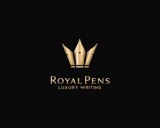
Royal Pens (1)
by andreiu • Uploaded: Mar. 05 '10 - Gallerized: Mar. '10
")
Float
(Floaters:
80 )
Description:
Luxury pens. Mark represents 3 pen nibs creating a crown.
Status:
Student work
Viewed:
29391
Share:


Lets Discuss
anyone seen anything like this?
ReplyThis is the closet thing I know of, but I don't think they're that similar:*http://logopond.com/gallery/detail/81327
Replythanks Joe! different enough i think :D
Replylove the xcicution...but sorry to say, the crown does not really look that convincing to me...i c a fat guy wid his hands up..:P...i think the side elements of the pen, can be shortened to make it look more crown like...imo.
ReplyThere was a logo called Sentinel I think... Trying to find it... Anyone?
Replynow i think it should convince you nithish. let's see.
ReplyI meant this one http://logopond.com/gallery/detail/29933*It just reminded me on this one...
ReplyAlen, i think the logos are different enough.. **Great work mate!
Replythanks for the comments guys!%0D*@Alen: i think these logos have nothing in common, but thanks for your attention anyway.
Replyvery good execution, those two are different concepts, i don't see any problem
Reply@Miroslav: thanks a lot for your remark, you sure are right! about the similarity, yes, i think it's totally pointless to say that they share anything in common.%0D*@dotflo: thanks a lot mate!
ReplyLooks nice my friend:)*I understand what Joe and Alen are saying but IMO different enough.*Keep up the good work Andrei!
ReplyLooks great Andrei!
ReplyGuys, where's the problem? I just said it reminded me, I didn't accuse anyone of copying or anything like that. I know Andrei i and know the work behind that name so I'm pretty sure it's all legit. The questions was: %22anyone seen anything like this?%22 and I pointed to a logo that uses the top of the pen for the inspiration (concept base) as well, that's all... All good... :)*
Replyno prob Alen. thanks!
ReplyNice andreiu, but it looks more like Pope Pens if that makes sense.
Replythanks Mike. great thinking, but still it wouldn't make too much sense to have it called %22pope pens%22. it would lose the idea of luxury.
ReplyThe symbol gives me a medieval-viking feeling :) and I like it quite a lot, and even i am not a big fan of the chosen type i think it's a nicely done job.
ReplyLol, I see what Nitish said... inda 'see a fat guy. But I get it, great idea and stuff.
ReplyI love the colors, I just wished %22PENS%22 was a bit bigger*-N8
Replyreally nice andreiu!
ReplyI think what Mike (logomotive) was trying to say is that it looks more like a pope hat than a royal crown. Which I agree with but that's basically the only critique I have - love the depth and subtle shading.**Monotone version would lose of lot of that impact though.
Replyreading the comment about the pope hat, %22Holy Pens%22 pops up in my head.......jk, jk...
Replythank you guys!%0D*about the pope hat, you're kinda right guys. i tried improving the royalty feeling and i'll upload a totally new version i made, very soon.
ReplyThis is a great mark. Clean and sophisticated.
ReplyCool! Great and intresting logo!
ReplyIn my opinion it's very nice and stylish :)
ReplyWow,this is a very fancy logo!Love it! :)
ReplyIt looks great!.*It reminded me of this one: http://logopond.com/gallery/detail/96210
Replythanks guys! :D
ReplyI love this. Reminds of Woody Pirtle%22s style.
Replylol.%0D*one idea, so different approaches%0D*http://logopond.com/gallery/detail/106525
Reply@strng: yep, different enough, but check my other version..
ReplyGood Idea....Keepgoing...
ReplyHey Can u give me an idea to design for my logo: IDEA STARTS
ReplyThis is on of my fav's. Love it.
Replythanks lumo!
ReplyAbsolutely great!*Very nice mark!
ReplyI love the idea!
Replylooks good m8. congratz
ReplyPlease login/signup to make a comment, registration is easy