Dutch Inspired
by DirkLeys • Uploaded: Feb. 26 '10 - Gallerized: Feb. '10
Description:
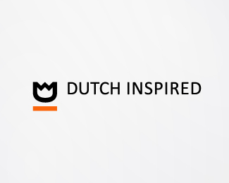
Logo for a blog/magazine full with inspirational work from Dutch designers.
The 'D' and 'I' are rotated and modified into a tulip.
As seen on:
Dutch-Inspired
Status:
Client work
Viewed:
8516
Share:

Lets Discuss
nice one Dirk!
ReplyThanks Thomas
ReplyClever!
Replylike it, like a lot. simple. clean. clever.
Replyreally cool logo, love the use of a tulip, and the orange mark, works so well
ReplyThanks all :)
Replynice and clean!
Replylooks great
ReplySo great!
ReplyThanks again all
ReplyGreat:)
ReplyThis is really cool, mate!!! Dutch design is very close to me, so I can really take this design to my heart :)
Replylove, love, love.
ReplyInto a crown too!
ReplyLove it man!**Goed bezig. :)
Replyvery nice Dirk!
ReplyPlease login/signup to make a comment, registration is easy