IT hotline (take 3)
by azao • Uploaded: Feb. 17 '10
")
Float
(Floaters:
2 )
Description:
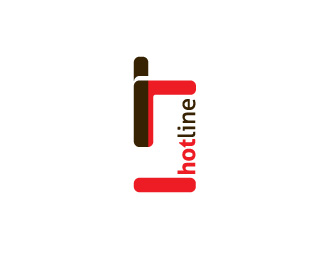
Well, this is another revision of logo for my own company's identity. This time I've tried to play with characters a little bit. 'I' and 't' has jumped out of the 'hotline' and formed an 'it' phrase, leaving two brighter spaces and an orphan blue dot. What do U think?
Status:
Unused proposal
Viewed:
1859
Share:

Lets Discuss
Please login/signup to make a comment, registration is easy