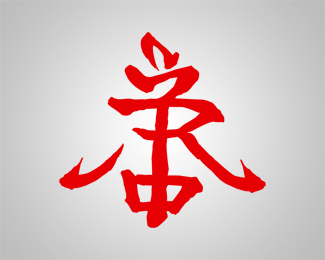
Very clever idea with monogram symbol on this. I just dont like typography and coloring. Position and size of symbol should be better balenced with typo. Anyways symbol is strong enough.
I agree with janzabransky. The Trajan font is a bit too common. Maybe if you got something similar, but not that. Also, those stars look a bit childish, in relation to the typography. Maybe sharper stars, more acute angles..
I know the stars may look better when sharp, but it's more related to the symbol, which has rounded corners too. Just wanted to be consequent.*I think you're right with the typo. I tried to hold on to the crown idea too much, and unnecessary underlined it with the type. I'll do some reaarrangement and post an update. Thanks for you opinion!


Lets Discuss
Very clever idea with monogram symbol on this. I just dont like typography and coloring. Position and size of symbol should be better balenced with typo. Anyways symbol is strong enough.
ReplyI agree with janzabransky. The Trajan font is a bit too common. Maybe if you got something similar, but not that. Also, those stars look a bit childish, in relation to the typography. Maybe sharper stars, more acute angles..
ReplyI know the stars may look better when sharp, but it's more related to the symbol, which has rounded corners too. Just wanted to be consequent.*I think you're right with the typo. I tried to hold on to the crown idea too much, and unnecessary underlined it with the type. I'll do some reaarrangement and post an update. Thanks for you opinion!
ReplyPlease login/signup to make a comment, registration is easy