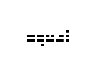
JAK
by Myco • Uploaded: Feb. 16 '10

Float
(Floaters:
5 )
Description:
One possibility for my own brand. Let me know what you think. Is it at all legible? Is it too "zune-ish"?
Status:
Nothing set
Viewed:
2890
Share:


Lets Discuss
Looks cool but the J does not read at all IMO.
ReplyThanks Glen. I've been having a bit of trouble with the J. I tried removing top, down-facing triangle and thought the change made it somewhat more legible, but in the end, I thought the bi-lateral symmetry of this version looked nicer. Do you have any other suggestions on how I might improve the legibility?
ReplyI see the J as a D really..**Not sure how to solve that one, that's your problem. haha :D.**Like where it's going though.****
ReplyI wasn't sure about first letter before looking at the name. otherwise looks good.
ReplyI thought it was JAC...
ReplyPlease login/signup to make a comment, registration is easy