Danzk
by chopeh • Uploaded: Feb. 12 '10 - Gallerized: Feb. '10
Description:
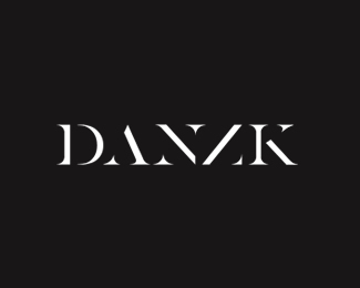
(Revised) Logotype for a Danish online culture, design and food magazine. Played about developing a stencil typeface, not entirely happy with it yet so looking for some critique - is it legible enough?
As seen on:
Danzk
Status:
Client work
Viewed:
31051
Share:


Lets Discuss
Yeah I read it right way. Think it looks absolutely beautiful.
ReplyThis is soooo great. Fav!
ReplyI think the ANZK look great maybe play with the spacing of the D? or slightly widen but VERY cool.
ReplyThanks for the comments - Think I agree with your there LOGOMOTIVE, does seem a little out of sync with the others.
ReplyLOL caps locked.
ReplyCaps lock is cruise control for cool :D
ReplyThis is totally legible. **Have you tried building D's vertical stroke out of N's end caps, i.e. just two triangles?
ReplyAwesome!!
Reply@epsilon**Yeah, I've played about with various D's - but I'll give your suggestion another shot. My main concern was the legibility between the NZ, so I wanted to keep all other characters as clear as possible.
ReplyNZ is very cleverly done. It took me a moment to realize Z was missing a part :)
ReplyNice job here!
Replyyeap, very good!
ReplyI'm with Logomotive on this one. D slightly tight. Nice all de same.
ReplyCheers guys - The fault with the D becoming painfully obvious to*me now I've stepped away from it for a while. Will be fixing that guy in the morning!
Replyi think it looks very elegant :)
ReplyLove this, very smart
ReplyOpened up the D a little, prefer it now.
Replylove it, good work %26 yep it's legible
ReplyReally surprised this didn't make the gallery...not every day you something unique and well-crafted like this.
ReplyCheers guys.**I was a little disappointed it didn't make it either - put a lot of work into this one.**You win some you lose some I guess :(
ReplyHello chopeh! Great and nice typo!
ReplyIt felt like years! :(**Thanks for adding it though, made my day :D**@vasvari - Thanks!
Reply%5EWell done.
ReplyI don't think legibility is an issue here, I read it straight away. Congrats on the gallery spot!
Replywow, nice concept..
ReplyThis revised version is perfect. Perfectly legible.
Replycongratulations chopeh! **I love this logo
ReplySuper! I can read it perfectly. Great solution, and well deserved gallery spot.
Reply%5E%5E Thanks :D
Replyless really is more
ReplyGreat logo! Fantastically cool! %3B-)
ReplyIt is beautiful, but to close to Paul Barnes' work. He did something very similar to this more than 10 years ago. the font is called %22dala floda%22 and its property of frieze magazine. This kind of game happens on some of the issues all the time.%0D*%0D*%0D*http://moderntypography.com/Typedesign/DalaFloda/PageOne.html
Reply@dust**You're right, it is very similar!**I can honestly admit I've never seen Paul Barnes work before. It's a little disappointing actually. I spent a long time working on the this logotype, with many pages filled in my sketchbook with different variants on it.**I'm making a blog post on the process it took me to design this from start to finish, so you can see how I arrived with this design.**I guess you're right, this kind of thing does come up time to time. It's just really disheartening when you've created something you're really proud of... just some guy did it before you.**:(***
ReplyI'd think we'd all know by now that nothing's new or original in this line of work. As long as you're not intentionally ripping someone off, you're fine. Don't let this distantly-similar work bring you down. The logo rocks.
ReplyOh yes, don't get me wrong chopeh, i really like the logo, but the similarities are evident and some people will find it too close for their taste. If you read Frieze it feels recognizable straightaway. Anyway, it's true that pretty much everything has been invented, and you might get that font as a good reference to make your letters a bit different in your logo to make it even more your own... Anyway you should know that this font is only used for the headers on the magazine and its communication, so it is still pretty unknown...
ReplyThis is excellent.
ReplyYes I've seen this font style used many times over the years but it's no different to using a stencil font for example. You've made it your own by removing the crossbar of the A and linking the N and Z.
Reply@Climax - Yeah, I understand your point - If both uses of the similar typefaces were logos I'd be more worried.**@positraction - I wish everyone could see it from that same perspective. :)**@dust - Yeah, I get that. Thanks for bringing to my attention though. I find it pretty fascinating now actually%3B 2 different people can create something pretty similar without one seeing the others work... **@firebrand - I've seen something around these lines now I've looked into it a bit more. Semi-glad I didn't look into it before otherwise it could have effected the outcome of this logo. Not sure for better or worse though.**@rudy %26 thisGuy - Thanks :D****
ReplyThis mark is such a sleeper - and I mean that in the best possible way - At first I kinda glazed over it, but when you take a closer look, it's pretty incredible. **I also love that the letter 'Z' is practically non-existent in physical form, yet it is still 100%25 legible.
Replyhaha I like this! It's pushing the envelope and still very readable.
ReplyYes, it is fully legible at first sight, also meets my understanding of an individual magazine publishing culture, design and food. A solid and well done Concept, maybe not able to get a hold on cold, high key colors (i'm thinking of an alwys changing Magazine Layout), but that's just a short thought.
Reply@koodoz %26 mattaebersold - Thanks for the kind words :)**@Zephon - Thanks, luckily the site is changing more to a blog style so the logo will likely remain on a consistent colour. But I agree, it could be less effective on high key colours.
ReplyCool, really fine logo!
Reply@designoman - Thanks!**I've posted a a blog post on the process of designing this logo over at my site %22here%22:http://www.chopeh.com/blog/logo-design-start-to-finish**
ReplyReally good job on this one Pete! And great post on your blog as well. One suggestion though, I would pull the %22A%22 up into the ascender line slightly to correct the %22A%22 seeming to be a little smaller than the rest.
ReplyDespite being a good job reminds me of Shaolin style - %22http://new.myfonts.com/fonts/testpilot/shaolin-style/%22
Reply@Art Machine - Thanks, and good point. However I've banned myself from poking about with it for the moment. I might notch it up a lil' when their website goes live. :)**@antyclymax - I can see where you draw the similarities there.
Replyvery very cool.
ReplyI absolutely love it! Very cleverly made. The pointiness of the characters compensates for the missing lines that should be there and allows the user's eyes to follow in a consistent way. Very clever! Well done!
Reply@Alanna %26 Amafi Designs - Thanks! :D
Replysmartly done :D
ReplyI like the in-depth breakdown of your logo-process http://www.chopeh.com/blog/logo-design-start-to-finish/ It helped me appreciate the logo more. Well done dude. I actually prefer it black on white background, but the black/grey colours of the under-construction danish blog look slick.
Reply@konvival - Thanks :)**@plantingseeds - Cheers for stopping by and taking a read, glad you enjoyed reading about the process. It's more than likely that on the final website the logo will be on a white background.
ReplyNow that's beautiful craftsmanship. Well done my friend.
ReplySpan!.... http://www.nzso.co.nz/home
Replyoops, I meant snap!
ReplyThis %5E looks like a recent rebrand. Here's how their logo looked in 2008 - %3E%3E %22clicky click%22:http://web.archive.org/web/20100716000159/http://www.nzso.co.nz/Site/Files/c/65acbb0aac805a2ba9c2e4c148c348b/af7107bcafabfdd4b75b8eaa79f30f5a/NZSOlogo.gif %3C%3C
ReplyReally fine logo !
ReplyI really love the logo, how can I contact you? I need a quite similar logo.
ReplyPlease login/signup to make a comment, registration is easy