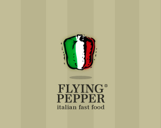
flying pepper
by Nitish • Uploaded: Feb. 11 '10 - Gallerized: Feb. '13

Description:
wip...an italian fast food chain...
Status:
Nothing set
Viewed:
4552
Share:


Lets Discuss
like it nitish but he flying feel is not coming truely! may be due to thick outlines... my guess may be wrong:)
Reply%5E%5E%5Ehmmm..line weight..i ges u have a point..i am still on the drawing board wid this.
Replyit might be those dots scarttering around, i thought it's a %22terrified pepper%22....
Reply%5E%5E%5Ehahha...will ask the client to change the name..sounds more fun
Replylol , indeed
ReplyI agree - it doesn't appear to be flying at all - more like floating because of the drop shadow. I think you're going to need to add wings or a trapeze or some other type of flying implement to get the point across.
Replymaybe you could trun it a little clockwise and then add some action lines to show movement. thought.
Replyupdated ver 2...http://logopond.com/gallery/detail/93872
Replylove the pepper, hate the shadow
Reply@ brandclay...chk ver2..i would like to get some C2C on that...:) thx**ver 2 http://logopond.com/gallery/detail/94047
ReplyPlease login/signup to make a comment, registration is easy