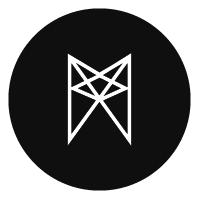
WINCHESTER FENCING
by Nitish • Uploaded: Feb. 07 '10 - Gallerized: Jun. '11

Float
(Floaters:
42 )
Description:
same ver wid different formation of W
http://logopond.com/gallery/detail/93158
Status:
Nothing set
Viewed:
6974
Share:
Lets Discuss
yea, for me this works better. and it still form the %22W%22 , in a shaper way.
Reply%5E%5E%5Ethxs a lot...i feel i need to make the mark a lil more aggressive...
ReplyOhhh this one is a lot better! Definitely has a nice W feel to it as well.
Replyheheh...ye joe...i fel this is it...my only concern was i hope they dont look like jedi wid lite-sabre...:)
ReplyNah, I didn't think about the jedi at all. the mask and the clothes did a good job is making it about fencing.
Replynice markk
Replyhey thx felro...:)
ReplyThis is a sharp, tight logo. High class!
Reply%5E thx again...:)
ReplyThis is strong! Great style!
Reply%5E%5E%5Ethx dude
ReplyI like this, good job.
ReplyBrilliant stuff, Nitish bhaiya! :)
Replymr. j and mr. a...thx a lotz
ReplyWow!! Great style mate!
ReplyAwesome job!
Replyawsome work Nitish!
ReplyNice. Good Idea
Replygreat style and colours!
ReplyLooks great, really like the colors.*I wonder if it would work with just the upper body?
Reply%5E thx everyone! much appreciated
ReplyPlease login/signup to make a comment, registration is easy