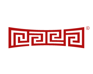
The New Raja Logo
by Raja • Uploaded: Feb. 06 '10

Description:
Here it is, evolved, bigger, wider, and now an ambigram.
This is currently being sculpted out of solid metal by a client (see Incendio logo in showcase ) at a height of 3 feet with a chrome finish.
What do I do with the tattoo now? lol
As seen on:
www.rajasandhu.com
Status:
Nothing set
Viewed:
13353
Share:


Lets Discuss
%22Raja - previous logo seen here %22:http://logopond.com/gallery/detail/848
Replyawesome!!! fantastic raja.
ReplyNice - has more emotion/personality now. Love it
ReplyHot stuff Raja! %3B)**Think I can I get a slight bump on the %AE weight?
ReplyAnd btw, your tattoo should look like this one anyway when you flex...
ReplyThis is a fluid design, great work!
ReplyRight on Bro. Nice improvement. Would also make a great tattoo wrap kinda tribalish.
Replyvery good.
ReplyAmbigraaammsss :) **Very very nice, Raja!
Replyi somehow like the previous one better. but i guess to each his own :)
Reply%5E this one is more elaborate execution of a more elaborate concept. I am with you though, I too like previous one better.
Replyah damn, like the previous one better, far superior, sorry.
ReplyRajaness...loving it!
Replyrajaplex.
Replythis is very nice too, although my vote is on the previous design :)*both makes me want to grab a pencil and start solving the maze...
Replyyeah i'm whit the first, but this one is great too!
ReplyMan, I actually prefer the original one as well. This new version being stretched and all seems forced to me. That might just be because I'm so used to the original. Also, this is not a true ambigram. Have to call you out on that one! %3DP
ReplyI am also in the group of peeps that support previous mark. Not only that curved maize hurts the eyes in a way, but Raja was hard enough to read with the previous one and this made it even harder... Find a person who haven't heard of you (it will be hard, I know, but there are a few) and if that person reads Raja within 30sec, I'll give him/her a %24100, straight up. Wait a sec, make that %241000... :)
Reply%3EWait a sec, make that %241000... :)*That's bold, Alen.
ReplyHey Alen where shall i send my address for my cheque ? %3B)
ReplyLOL Kai*Alen Pavlovic, Domzalska 4, 48000 Koprivnica, Croatia*But that's only if you didn't hear of Raja before %3B)
Replyraja who ?
ReplyFair enough! LOL*Send me the info, you just won a %241000!
ReplyThank you for lookin! I really appreciate the feedback.**- Mikeymike, thank you**- Josiah (siah-design), thank you, and lol@flexing**- michaelspitz, thank you, good point abut the %AE, thing is, I actually used the legal vector they provide you when you register a logo, didn't think to adjust it, but it would look better**- JF, thank you**- Mike (logomotive) thanks brother**- milou, thank you**- Bitencourt, thank you**- sandhya, thank you, maybe the previous one is better?.. I just felt I had to reflect my change and growth**- epsilon, thank you**- mcdeven, thank you, that's why I posted here, for your opinions**- Fabian (brandsimplicity), thank you****- Roy (firebrand), thank you, odeon lol**- David (climaxdesigns), thank you, good question, the design is far from perfect, to some the J jumps out, to others, maybe an E, as far as rotating, that would mean a complete re-design, maybe in another couple of years :D**- kathariney, thank you, I suppose when compared, one will be more liked, that's the law. If it makes you want to grab a pencil, well that's a good thing for a designer!**- chrisrojo, thank you, looks like the other one gets another vote so to say**- onetreeink, thank you**- Kevin (OcularInk), thank you, glad you had a fine toothed comb :D The term ambigram is an ambiguity in itself having spoken to the gentleman who coined it, but it's not the typical ambigram as in a symmetrical reverse read, so I'm gonna still call it one haha**- Alen (Type08), thank you, I sort of want it to be hard to read (if, at all), the aim is to just have it recognizable. Save your %241000, no one is going to be able to read that LOL, and of the 10 people that know me, they still can't! **- kaimere, thank you, I think I forgot my shades at your place (save your money Alen haha)***I honestly appreciate you all for looking and leaving your comments, as I am fan of your work.*
ReplyI'm sure you could get some sort of skin tuck to fix the tattoo %3B)**Cheers for the comment on my website btw :)
Replyraja, in fact the first time i saw your logo, it's the one with %22amaze%22 underneath, so i was trying to hard to read the letter%22m-a-z-e%22 out of it....than i thought , maybe it's just a drawing that looks like a maze. i was like %22oh , cool, an amazing maze.%22 lol
ReplyI think as a stand-alone mark its cool, I really like the feel, but think it would really need to be accompanied by the text (for people who don't already know what it says).**Don't get me wrong, it's awesome, but without some help people aren't going to be able to read it.**Having said that I think you could easily just go by 'Raja Creative' or something like that now that its the core of your brand anyway.**Being picky but it's not an ambigram (oh, just noticed Kevin already got you there).
ReplyYes, its very hard to read...but that's the point. Great branding is something that can stop you in your tracks and make you think...WTF...am I looking at.
ReplyPLUS it's Raja's logos and he knows what he's doing, well I think he does.
ReplyI'm not saying it's writing, more of an abstraction of Raja... you know, a device, an icon.**- eziemac, thanks ha, yes I could and your site looks great**- kathariney, sorry to confuse you :( hope you made your way out, it's an easy one**- cobaltcow, thank you too, may sound absurd, but again not really looking for anyone to read it, in it's various touchpoints, it will not really require legibility you know what I mean? And about the ambigram, I am still going to stand my ground and say it is! (see reply to Kevin)**- ClimaxDesigns, thanks for clarifying, why you squintin in the first place lol**- brandsimplicity, thank you, glad you can't read it either, bingo! good points...**- logomotive, it's all a front! I wouldn't come here for help if I did
Replyheheh great!
ReplyThank you Kliment. I just got word that this logo was selected for publication in the new %22LogoNest Book%22:http://www.logonest.com/2010/02/raja/
Replylinen...
ReplyDo you know who's behind this LogoNest?
Reply%5Enot really... but you could always ask type08... he's a big contributer...
ReplyAha. Type has his fingers in a lot of pies.
ReplyYummy! %3B)
ReplyI believe it is Sinisa and his crew, who also run Logo from dreams...
ReplyYes, exactly, I only write weekly articles on logo design there, that is the only tie with the crew... By the way, stop by tomorrow for the new one... C yah!*Type08
ReplyOK cheers. Slick site.
Reply...and %22his%22:http://www.youtube.com/watch?v%3DbanXT6azA-4 work here was done...
Replythey say logsholiks are actually very smart
Reply*logoholiks
ReplyLove it, but must admit to preferring the original (at least I assume that other one is the original)
Replyyes, the other one is the first, this is one is for a different purpose, thanks logopunk
Replyi like this alot, i would rock this on a tee shirt ..
Replyawsm - getting apparel done up - thanks!
ReplyI like both the original and this updated logo, seeing how this one still works very well with the curves just shows the strength and attention to detail within the mark itself. great work raja!
ReplyHey Raja, nice step forward! :) I think it looks more friendly now. Cool thing it's an ambigram too. :)
Reply%5EIt's not an ambigram Alex...
ReplyYes it is Joe. And that comes from one of the pioneers of the 'ambigram' , my great friend %22John Langdon%22:http://www.johnlangdon.net/ambigrams/ %3C%3C click** Thanks for stopping in with your expert opinion though.
ReplyHere you go Raja, take a look at this: %22click%22:http://a.imageshack.us/img819/7788/8l2idn02.jpg*Sorry bud, not an ambigram.
ReplyI have to agree with joe, but it doesn't have to be an ambigram to be a good logo!
Reply_%22An ambigram is a typographical design or artform that may be **read** as one or more words not only in its form as presented, but also from another viewpoint, direction, or orientation. %22_**That's taken from wikipedia in regards to what an _ambigram_ is. There is no mention of the shape having to be the same from viewpoint, direction, or orientation... and to me at least... this reads as %22raja%22 from all viewpoints you presented JoePrince... so in conclusion... it **is** an ambigram. **sorry bud.
ReplySorry nido, it does not read 'raja' from the different viewpoints. Thanks for the uneducated insight you have anyway :)
Replyit does to me... hence %22... and to me at least... this reads as %22raja%22 from all viewpoints you presented JoePrince... so in conclusion... it is an ambigram.%22... so it is an ambigram... to me.**Guess that makes it your uneducated insight v mine?
Replyps.. I love how you girls get so sensitive... lol
ReplyIt reads 'raja' to you from each viewpoint because you have seen the original design before, bud. Just because it is an ambigram to *you* doesn't mean it is in fact one. You capeesh?
Replythis is to no one in general... but if you are willing to accept it reads %22raja%22 in its original form.. then it is no stretch of the imagination to read %22raja%22 in any other form... it just depends on imagination (or lack there of) and the willingness to accept (as you have done in its original form)**nothing to get educated about.**_Imagination is more important than knowledge._*Einstein
ReplyI don't care what any of you say, when I see this upside down,backwards, forwards, reversed out, or on the side of a DVD spline, I know it's Rajas logo :)
ReplyI find it amusing how you always have to step in and protect your little boy toy Raja. You never let me down nido.
Reply%5EI thought it was a discussion about ambigrams?... are you feeling hurt JoePrince?.. want me to be your buddy too?
ReplyNah, I don't like to be buddies with pricks. Appreciate the offer though.
ReplyI mean Spine. sorry just trying to change the direction.
Reply%22Nah, I don't like to be buddies with pricks.%22... aawww... you really are hurting ain ya?... sorry to have spoiled your night... I hope you feel better in the morning.**Still an ambigram.
Reply@logomotive... lol!
ReplySpoiled my night? Hardly. Just glad I don't see douche bags like you outside of LogoPond.*Btw, is your avatar an ambigram nido?
Replyoh cool... for a moment you came across like you were crying... but im glad you dont get outside logopond much...**anyway... to answer your question (glad to see we are back on the subject of ambigrams) No. My avatar is not an ambigram. im(uneducated)o
ReplyOf course you're uneducated, hence why you thought I was crying. While we're talking about your avatar, what inspired you to come up with something so brilliant? Guess it matches your personality.
Replybecause I didnt go college means I would never be able to tell when I think someones crying?... wow.. they have a class for that?**Anyway... we're not talking about my avatar... the discussion is about ambigrams... and I already answered your question about my avatar being an ambigram... and proved that this logo is indeed an ambigram... why are you deflecting the issue?... do they not teach at school how to stick to the subject?
ReplyNever cared much for school nido :) We've already discussed that raja's logo is not an ambigram. Thanks for the conversation mate.
Replyyou're welcome. but for what its worth, I was discussing that it is an ambigram. So lets just agree to disagree. As I said before.. until an ambigram expert chimes in with their worth.. it's your uneducated opinion v mine.**Enjoy your weekend.
ReplyQuick question for you, what makes your opinion more educated than mine?*
Replyas long as you stay on the subject im happy to oblige...**I wouldnt say my opinion is more educated than yours... but I made an (even if it was a slight) effort to explain what an ambigram was/is... my only source, granted, was wikipedia, some frown upon that... but a source nonetheless that backed my view... further to that I argued that it (to no great stretch of the imagination) does still read as %22raja%22 in your presentation... based on the willingness to accept the original...**My question to you would be, why are you (and what evidence do you have - based on what source) saying its _not_ an ambigram?... keeping in mind what ive already stated.
ReplyA true ambigram maintains readability either by reflection or rotation. In this case, it fails to adhere to either, thus meaning it is not an ambigram.
Replya fact is certain guys: nido's avatar is more than an ambigram, in fact.. it's a multigram. (:%0D*you can flip it in more than 2 ways to get the same visuals.
Reply%5EBut does it work in B%26W Andrei? :P
Reply%22A true ambigram maintains readability either by reflection or rotation.%22... is that your opinion?.. or are you getting that from somewhere?... it would add more value if you were able to back it up...**but i'll humour you.. lets start at its original form... we have all accepted it reads %22raja%22 when in fact.. it dont :)... but we accept that it does... because.. well... we do... the %22readability%22 here is based on acceptance of shapes and their form... not letters... because there are no letters... so when flipped/mirrored etc it is of no consequence to the shape and their forms... it still, by the very same suspension of belief we have for the original, reads as %22raja%22... hence, making it an ambigram...
Reply%5E well Joe, at least as you can see, it works perfect in color! :))
ReplyRotational * A design that presents several instances of words when rotated through a fixed angle. This is usually 180 degrees, but rotational ambigrams of other angles exist, for example 90 or 45 degrees. The word spelled out from the alternative direction(s) is often the same, but may be a different word to the initally presented form.**Mirror * A design that will read the same when reflected or viewed through a mirror.**Taken from http://www.ambigram.net/ nido. More or less credible from Wikipedia? Who knows.
ReplyDoes anyone want to be my buddy?
Reply@Andrei, haha. Wonder if it passes the scalability test though...
Reply@Joe: yep, it could even be 1x1px and perfectly mentain all the details :%3E%0D*@Raja: one of the most recognizable logos i've seen here on LP. great job.
Replyr
Replya
Replyj
Replya.
Reply%5EIs that how it would look on the DVD spine Mike? :)
Reply_Rotational*A design that presents several instances of words when rotated through a fixed angle. This is usually 180 degrees, but rotational ambigrams of other angles exist, for example 90 or 45 degrees. The word spelled out from the alternative direction(s) is often the same, but may be a different word to the initally presented form.**Mirror*A design that will read the same when reflected or viewed through a mirror._**and yet **none of this** proves that this is **not** an ambigram... if anything... it proves it is... you still havent acknowledged that you are willing to accept it reads %22raja%22 in its original form but not when flipped or mirrored.. ok.. let me ask you this then... what makes you accept it reads %22raja%22 in its original form?... if at all you do... **as for my avatar (why we are talking about that I have no idea... may be out of desperation) but my avatar is just an avatar, not a word and by no means a logo... its just an avatar... does it need to be more than that?
ReplyThe original form utilizes shapes that represent the letters of Raja. When seen out of its original context, the design loses readability with that order of letters. We can go back and forth all day nido, but in the end neither of us are ambigram experts.*As far as your avatar goes, friendly banter. Lighten up.
Reply_neither of us are ambigram experts._**then why say it isnt?... at least I was willing to back up what I said and maintain that it reads raja from all angles. You sound like you concede to me.**As for my avatar... no offence was even taken... feel free to make of it what you will.. i was only explaining that it means nothing... **anyway... I'm off out... have fun all.
ReplyEntertaining, yes, but the language got crude from one party (and not the party you would normally suspect). This is an open forum so being crude (and I've been warned when I should have known better) can get you kicked off. This is not an 'adults only' forum. But thanks for the 'education' on ambigrams. In the end they agreed in print (if not in mind) that this does qualify as an ambigram.**I have to say I did not realize this was a redesign. I thought it was the same logo stylized for something in particular. So for me it is no better or worse than the original. The logo works very well for Raja and is executed beautifully. Even though the concept is not unique, Raja somehow made it so.
ReplyRaja, when are you getting the apparel? want one.
ReplyRudy, we will talk soon :D
ReplyRAJA A MAZE :) nice modification
Replythanks alterego
ReplyGood work man! great execution...but like the previous! :)
Replythanks -- seems that the previous has more 'likes'**hmm..
ReplyJust confirming that this is an ambigram.
ReplyPlease login/signup to make a comment, registration is easy