cresk
by cresk • Uploaded: Feb. 02 '10 - Gallerized: Feb. '10

Description:
© Gert van Duinen | cresk design | idgram
As seen on:
cresk
Status:
Client work
Viewed:
28437
Share:



Lets Discuss
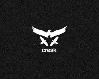
pretty cool use of negative space. Type is nice aswell.
ReplyNegative space is great! FYI: be careful with the type, though%3B that looks awfully similar to the Baltimore Ravens typeface.
Replyuuu very nice
Replysweet job man
Replyreally great use of the negative space, man. nice job. nice to see it in the gallery.
ReplyI agree with mcdseven: great use of negative space%3B you'd be praised by M.C. Escher :). I also have to tell you wings of the main bird are too straight to me.
ReplyThat is awesome! I love the mark. I didn't see the raven in the negative space initially, and was really excited when I realized it!
ReplyNice mark and type. That darn registered symbol is throwing the alignment off for me though.
Reply%5E The designer's bane. Nice mark.
ReplyThis is a very nice looking design, cheers!
ReplyI like this a lot too.**@ Kevin - Really? That little speck? Maybe you need to visit a doctor? :)
Reply@ ethereal : You have no idea. :-P
ReplyBrilliant!
ReplyThe Raven type looks a lot like the Baltimore Ravens. I like it a lot just thought i'd let you know though.
ReplyWonderful......
ReplyWow, I didn't know you were featured, Gert!
ReplyOh, that was a very long time ago %3B)
ReplyI am interested in having you take a stab at a new logo for a non-profit organization preparing for public launch. Please let me know the best way to get in touch. You can reach me at 831.475.9560 at the Dance of the Deer Foundation. Many thanks, Nico.
ReplyDear Nico Secunda,*I know I'm a month too late but I love your Dancing Deer Foundation.* if you read this can you please contact me at info@gertvanduinen.com ?
Replycoool
ReplyGj on the logo, Gert, its a very smart use of the negative space. :D
ReplyIs great native logo!
ReplyFree!
ReplyPlease login/signup to make a comment, registration is easy