Hypnotic Design
by jgarnerdesign • Uploaded: Jan. 31 '10 - Gallerized: Apr. '10

Float
(Floaters:
38 )
Description:
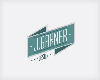
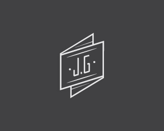
Self-promotional logotype for my design co-op, Hypnotic Design. Critiques and suggestions welcome.
Status:
Client work
Viewed:
21139
Share:
Lets Discuss
Looks good :) But is this the same mark?
ReplyMore or less, I re type-set some of the text and made some minor adjustment to graphic elements. Pretty sure I'm done with it though.
ReplyI think this is cool.. and I'm a huge fan of helenic.**Have you tried your secondary copy in all caps? Not saying that that'd be better, but it may feel a little more structured.. **Also may be cool to try adding colors.. offsetting them.. overlaying them and what not- like your Double Vision logo..**These are all just thoughts, but I think it's very cool as is.
ReplyAwesome stuff. It would be fun developing stationery for this one.
ReplyI really like this. Nice job.
ReplyThanks guys. I'm going to revisit it a bit. Cheers.
ReplyEE! %5E)
ReplyEE! 8)
ReplyVery good man!
ReplyMay I ask what font you set %22Hypnotic Design%22 in?
ReplyPlease login/signup to make a comment, registration is easy