Massage by the lake_6
by Mikeymike • Uploaded: Jan. 26 '10 - Gallerized: Feb. '10

Description:
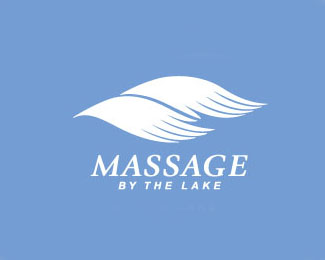
(revised)Client wanted something a little simpler. WIP. would love some comments. still working on the hands. rounded off finguretips.
Status:
Client work
Viewed:
9016
Share:


Lets Discuss
I'm digging the simplicity of the hands on this update. One color might be the way to go on the hands...it flows better.**I think the mark is solid but the type needs some help. Make some breathing room between the mark/type and explore some other options with fonts. Have you tried %22massage%22 in uppercase so you have more work room with the type underneath? Just curious to what you've all tried....I'm just one opinion.
Reply%5Ethanks matt. great suggestion. took it up a notch. IMO.*
Replyi would love to c the mark and typeface combine in some ways...maybe its the way the mark flows it creates a negative space...and because of that, the structure of this logo does not come together...IMO.
Reply%5E does that work better, houston? i think it helped. thanks.*nitish.b i am trying something witht he %22s's%22 in the name, just seems to get a bit busy. i'll post if i think it gets closer to something workable. thanks for the suggestion.**
ReplyIt's definitely becoming better! Keep messing with the fonts. I'm the worst with fonts so I hope others will comment on whether serif or sans serif....
ReplyYou might actually be able to get away with italics on the font. It might reinforce the %22flow%22.
ReplyFine work!
ReplyLove the simplicity on chromatics and form. I would suggest only to soften the ending of the fingers, and maybe reduce the space just a bit between the characters to make a resemblance on all of the composition. But a great and fine work indeed!
Replythanks for the gallery spot. means a lot. *and thanks for all the comments.*thanks matt, for the direction of changing out the type i had in there at first. it really helped.**Bucket-brands, thanks for the suggetions. i am continuing to work on the hands they ar just not right yet. i'll post when done.
ReplyLooks great Mike, nice work!
ReplyLooks nice!
Replyso soothing ahhhhhhhh**great work Mikeymike
Replyi love the concept...but i have the same problem that i had b4...the structure (mark %26 type) jus does not come together form me...IMO...maybe its jus me...:)
ReplyHey mikey..love ur mark but take a look here. just to inform nothing else*http://logopond.com/gallery/detail/39967*http://logopond.com/gallery/detail/39979..
Replylovely!! I can feel the massage... good job!!
ReplyThis mark turned out purtee fine mate!
ReplyThe client has finally agreed on this design and we are moving forward. Whew.
Replyhttp://99designs.com/logo-design/store/47121
Reply@Jerron thanks bud. I contacted 99design and I hope they make this designer take it down. Appreciate the watchful eye.
ReplyGood luck getting it withdrawn from the site Mike. I've found 99 dezigns to be the least cooperative crowdsourcing site where removal of stolen work is concerned.
ReplyWell, I hope they change, Roy.
ReplyThey had someone using my pencil light bulb as their personal avatar, and after I contacted them they at least made that designer take that down.
But this being a placed as a logo for sale, may be a lot tougher. We'll see.
Since I missed it when it was uploaded... at least I can vote now! :-)
ReplyTHX, Jan. Appreciate you coming back and taking a look see. cheers.
ReplyPlease login/signup to make a comment, registration is easy