Alexander Spliid.v3
by AlexanderSpliid • Uploaded: Jan. 21 '10

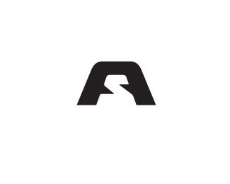
Float
(Floaters:
16 )
Description:
Current version of my personal identity. - still messin' round with this one, so any thought is welcommed :)
Status:
Client work
Viewed:
2579
Share:


Lets Discuss
Looks good to me! %3B)
Reply%5EAgree as you already know - but have you tried making the a lines a little narrower? Just a thought :)
ReplyNice update, looks good!
ReplyThank you guys, and nope jacob, i will try see if it works out.
Replylooks good.
ReplyThanks EBrown, and thanks for the floats.
ReplyGood one.
ReplyThank you mabu, means a lot. I am a huge fan of your work :) og jeg er i %F8vrigt selv dansker :)
ReplyI like it. I keep wanting to make the symbol a little smaller for more subtlety and sophistication. I understand the symbol dominant orientation here but I think it might look more sophisticated a bit smaller. More buggish than large symbol. Just a thought, bro.
ReplyThank you ethereal. You where right about the size of the mark, so here is an updated version.**I've reduced size of the mark, fixed some minor kerning problems (not solved completly yet) and i have played around with the colors, to give the whole deal a little more personality :)
ReplyThere you go, nice Alexander. Seems more balanced and feels right now.
ReplyPlease login/signup to make a comment, registration is easy