Chameleon
by JeffFisherLogoMotives • Uploaded: Apr. 04 '07 - Gallerized: Nov. '07

Float
(Floaters:
25 )
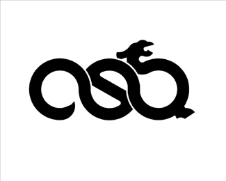
Description:
Personal logo for a hairstylist who desired images of swirls, and a yin/yang reference, in her identity featuring a chameleon. The font is the historic Kells Round from P22.com, giving the logo a Celtic type treatment as requested by the client. The logo will appear in the book LogoLounge 4.
As seen on:
Jeff Fisher LogoMotives
Status:
Nothing set
Viewed:
13181
Share:

Lets Discuss
Man, that is wild...I LOVE it!!
ReplySemiologically speaking, dont you think this represents chameleons rather than chameleon?
ReplyHey, the illustration style is very cool but these look more like Rock Lizzards/gheko's than chamelons and there is a very big difference.
ReplyHaving had a chameleon myself I based the design of creature on photos of my own very fat chameleon and, besides, it's not intended to be a literal interpretation . The result, in duplicate (in response to dache's usual inane %22criticism%22), met the requirements and specifics of the client brief - and, in the end, the person paying the bill is the party I need to please with the finished design.**
ReplyJust asking about the logic of showing two chameleons when the company name signafies one, nothing inane at all.
ReplySimply beautiful...
Reply(in response to dache's usual inane %22criticism%22).... LOL. Nice work as usual Jeff.
ReplyHey Jeff love this and your portfolio def. one of my fave designers and influences ... lemme ask Dave how come hes only putting you up now :)
ReplyK - Thanks! Actually this is 'round 2' for my work being featured...
Replyoops :) mabruk ...
ReplyHey, sorry to keep this one going on (I have lots of respect for your work) but would still beg to differ. For years the sort of illustrations you've used have been printed on African cloth to represent gheko's an dlizzards, because of the dufficulty that a chameleons body presents from above(to illustrate that is) they are often illustrated in profile (Their more becoming angle) Pleaes pay good attention to the toes on the Chameleon and those on the checko, but maybe this as like the subtle difference between a tortoise and a turtle. *Please note I have great respect for your work, and only state the following as research reference.***Chamelelon ref* *as seen in this image search http://images.google.com/images?q%3Dchameleon illustrations%26ndsp%3D21%26svnum%3D10%26um%3D1%26hl%3Den%26client%3Dsafari%26rls%3Den%26start%3D0%26sa%3DN**Chamelelon ref* *http://images.google.com/images?um%3D1%26tab%3Dwi%26client%3Dsafari%26ie%3DUTF-8%26oe%3DUTF-8%26rls%3Den%26q%3Dchameleon%2520feet**Gheko reference* *http://images.google.com/images?um%3D1%26tab%3Dwi%26client%3Dsafari%26hl%3Den%26rls%3Den%26q%3Dgecko%2520illustrations
Replyw - I appreciate your efforts to 'educate' me in proper lizard identification - the image used in the logo is in no way intended to a literal representation, but simply a cartoon-like graphic illustration.
Replyluv it.. the pattern in it reminds me to the aboriginal arts.. :)
ReplyReally like these lizards and the way they are positioned as well.**It also reminds me of Lanzarote's national symbol, which is a lizard too (wonderful island though).
Reply@ waltermurray**I'm with Jeff on this one. While attention to detail is always important and sometimes literal representations are essential, I don't think it's necessary in this case. No one is going to have a difficult time associating the name with the icon. The name is 'Chameleon' after all. If his target audience were reptile experts, than your point would be more valid. I think his slightly stylized version here works nicely. Just some thoughts. :-) **Glad this one made it to the front.
ReplyMaybe u can work with the font, it looks not professional. The graphic has potential.
Replyone of my favourite logos on the pond!
Replyi have an idea - since you mentioned 'ying %26 yang' in your logo description, wouldn't it be great if you can make the lizards into %22ying%22 and %22yang%22 ? like positive %26 negative lizards ? %0D*%0D*just a thought ... it's a great logo though :)
ReplyHAWT! luvit
ReplyI like this but it reminds me a SoBe. Yours seems a lot more playful though. Good work.
ReplyPlease login/signup to make a comment, registration is easy