Home
Gallery
Activity
Creatives
Sign In / Register
Featured
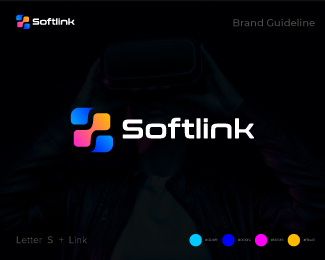
Roundrobin
Kreatank
Float
Mascot Screen Printing Detective Logo
Proffalices
Float
Turbo Fit
Miranchukova
Float
Letter D minimal logo
Uzayrali
Float
Minimalist Komodo Dragon Logo
TheLionStudios
Float
Hoodie Screen Printing Paint Logo
Proffalices
Float
Cute Donut Ant Queen Logo
Proffalices
Float
Cute Worker Screen Printer Logo
Proffalices
Float
Flying bird minimal logo
Uzayrali
Float
Letter A and colorful heart logo
Uzayrali
Float
unlocking potential wordmark logo
Uzayrali
Float
RoundRobin 2.0
Kreatank
Float
Owl fire blaze logo
Uzayrali
Float
Love birds logo
Uzayrali
Float
Duck colorful logo
Uzayrali
Float
More
Featured Artist: designerjony
Follow
designerjony
Logos :
57
Letter Z Tech Logo
Designerjony
Float
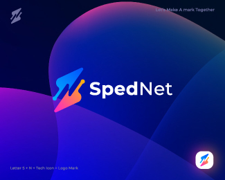
Letter S + N Tech Logo, Modern Logo Design
Designerjony
Float
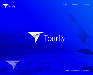
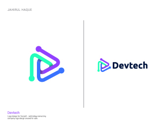
Letter T Paper Plane Logo
Designerjony
Float
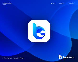
Letter b Logo, Modern Logo Design
Designerjony
Float
Letter Z Blockchain Logo
Designerjony
Float
Letter T Pen Logo
Designerjony
Float
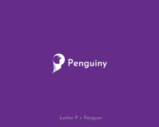
Penguin logo
Designerjony
Float
Letter S Logo, Modern Logo Design
Designerjony
Float
Letter S Blockchain Logo Design
Designerjony
Float
Letter Q Bolt Logo
Designerjony
Float
Letter C Arrow Logo, Modern Logo Design
Designerjony
Float
Letter M Logo, Modern Logo
Designerjony
Float
Letter P Pixel Logo, Modern Logo Design
Designerjony
Float
Letter-RP-or-R-Logo,-Modern-Logo-Design
Designerjony
Float
G Letter logo
Designerjony
Float
Tech Logo Design, Modern Logo
Designerjony
Float
C Letter Logo, Modern Logo
Designerjony
Float
Modern N Logo
Designerjony
Float
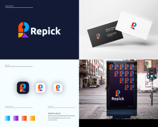
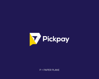
Letter-P-Paper Plane-Logo-design
Designerjony
Float
App Logo Design, S Logo Mark
Designerjony
Float
Recent Discussions
ehloom
https://multilogin.com/vi-vn/antidetect/antidetect-browser/
Cope
@ralphburke
Thanks, Ralph!
travey213
Nice
Cope
@rashomon
Thanks, man!
rashomon
that's cool, man !
Davidselvam
Dios Success Enterprise
More
Creatives
tanami
Follow
95 Identities
Following 181
260 Followers
Follow
alearedesign
Logos :
4
Follow
roespinoza
Logos :
32
Follow
Tickstyle
Logos :
58
Follow
uzayrali
Logos :
77
Follow
designerjony
Logos :
57
Follow
stefkarte
Logos :
36
Follow
SIGIS
Logos :
83
Follow
grishabel
Logos :
94
Follow
logotremolo
Logos :
33
Follow
proffartline
Logos :
593
Follow
TheLionStudios
Logos :
233
Follow
vivablu
Logo :
1
More
Logopond © 2006 - 2025
Contact: Management
|
Terms of Service
|
Privacy Policy
|
Advertise


https://multilogin.com/vi-vn/antidetect/antidetect-browser/