Folder
by Rokac • Uploaded: Jan. 14 '10 - Gallerized: Feb. '10

Float
(Floaters:
145 )
Description:
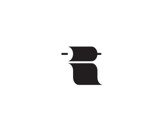
Logo for a software company.
As seen on:
-
Status:
Unused proposal
Viewed:
39423
Share:


Lets Discuss
I think the mark is a little small, but like the idea :)
ReplyThanks Breno:)
Reply%5E Yes and yes.
ReplySorry, that was a reply to Breno Love the mark, but it's a bit small.
ReplyReminds me of %22this%22:http://logopond.com/gallery/detail/861 though I understand they are different concepts.
Replysmart!
ReplyThanks guys. I appreciate the comments.*@Jared*I agree,similar but the concepts are different, just as you said:)*@Sean *Hmm,I think you're right, it does look a bit small. I'll work on it:)*Cheers guys!
ReplyUpdated. Works much better this way. Thank you Dalius:)*Darm I love Logopond:)
Replyvery good
ReplySmart work.
Replycool, I see this version better
ReplyNow that's hot!
ReplyThere you go. Awesome!
ReplyThank you doflo, JF, Jan, Joe, and Sean!*I really appreciate it guys:)
Replyoh yes! very nice solution here!
ReplyThanks Andrei!*Means a lot coming from you:)
Replygreat idea on this one!:)
ReplyThanks fourplus. I appreciate it:)*Btw. love your work guys. Especially what you did with that basketball gym.
ReplyThanks for your kind words Igor!*Means a lot coming from grande maestro like yourself:)*Cheers!
ReplyCool! I've added it to my favorites.
ReplyThanks cleber! Btw love your avatar mate:)*Also thanks David for the gallery spot. Much appreciated.
ReplyVery clean and simple. I like it.
ReplyLove the simplicity! magic :D
ReplyThank you mattaebersold and ksnagra!
ReplyFine idea!
ReplyCheers designoman!
ReplyI'm sorry if i'm nay-saying too much...but I feel like a lot of the logos making the main page these days aren't actually marketable to actual businesses. I can appreciate art for art's sake such as this. But is it really a logo if can't be put to good use? I mean it's more of a clever play on words with art than a logo. Again not trying to make waves but I feel like making the front page has to be more than being clever with name and mark.
ReplyI agree completely. The simple reason is that mostly you get the impression that the starting point is a visual idea and the outcome then is more or less accidental.
ReplyThanks for your thoughts Chris.*Sorry that this logo didn't satisfied your standards when it comes to %22who gets to the front page%22. It's not up to me.*Btw it was done for a real client but rejected. The company name is %22Folder Track%22 (I've removed the %22track%22 part just because it looks more awesome this way:). Hence the open filecabinet concept. Hope this will help.*Cheers mate...
Reply@barry*Thanks for stopping by.
Replygreat one!
ReplyAwesome stuff
ReplyThank you ram and hozella!
Replyand this company does really exist ? what they do ?
ReplyUsually I'm a cool guy but when paratroopers like %22variant73%22 lands on my head I turn into Mr. Hyde.*%22Variant%22 whats your problem? I see your have been inspired by some recent comments. How come that guys with %22most creative showcases%22 are throwing these squibs? Especially to logos that end up on the front page. Then I have to spend my time explaining logos to someone like you.*I can take critics, au contraire I encourage criticism as long it's constructive.**So %22variant%22 please do get off my back and spend your valuable time somewhere else.
ReplyRokac your passive aggressive attitude is totally unwarranted. I originally was just commenting on the general trend on logopond, but your attitude has deemed it necessary to comment on you specifically. Your idea is not inspired, it's lazy and easy. It looks like you just simply tacked on some random type face to help remind us that the mark was a filing cabinet.*All Variant asked was if the company was real and what the did. Did you respond like a reasonable person, no you lashed out. How dare we question you?! In the end, I'm a bit curious about what they do as well and which proposal they actually did use if not this one and why is that not in your showcase? You don't want critiques, you want people telling you how good your idea is and the instant you're at all challenged you get all defensive and passive aggressive.
ReplyOk lock_designs, you've made your point. I apologize for my previous comment if it offended you or anyone else.*Again I'm always open to listen thoughts from other designers (the green flag on almost every logo in my showcase) but comments from barry and variant were posted with such arrogance that I just couldn't get pass them. *Btw. this is the company: *http://www.foldertrack.com/*And here is the contest:*http://99designs.com/contests/35180*For scanned pics from my sketch book drop me an email. *Cheers lock_designs
ReplySeriously, I had no intention to make an attempt to trash the logo or make an arrogant remark. I believe the observation that there is a great amount of logos apparently created merely for oneself, often the %22cute%22 or %22fun%22 ones, entering the gallery, is undeniable.
ReplyNice Roko
Reply@barry *All cool mate:) Just one thought. A good concept is a good concept, whatever purpose it's made for:)*@absoludicrous *I hear you Anthony. But, that's another story, sigh...
ReplyThanks Craig! Means a lot coming from you:)*
ReplyAdditionally, while I don't think my first comment is unclear in any way, it IS a surprise that this has been done for an actual company, because Folder is a generic term. And the point above basically comes to the question in general, e.g. is making up a generic term like %22Car Company%22, shaping the Cs into headlights as challenging as working for a real car manufacturer to create something unique that captures the client's identity. %0D*%0D*I have no objections against this Folder logo, it looks a bit tight, but maybe it%B4s because you%B4ve used a lot of blank space around it. Works nicely in monochrome, is smart and possibly something you won't get tired of.
ReplyI agree with all people who say that there's a bad trendy here, and some logos are made just for fun, completely forgetting the customers rules and their frequently weird questions and requests. When you have to make a logo for someone who pays for it, it's very difficult to get along with a %22simply%22 clever idea. And this logo is the dimostration of this whole theory, because i find it simply wonderful in his smartness and it is for sure very effective, but the client anyway rejected it... *I appreciate a lot this logo, but very often creativity is not well rewarded...
ReplyRokac, take it easy man, your logo is amazing :)
ReplyThis isn't the first time this issue has been brought up. At the end of the day though, this is an inspiration-based website- and this right here is inspiring. Great job Rokac!
ReplyThanks all for your thoughts.*@bitencourt*I appreciate it %22Breno I am brazilian%22:)*@Chad*%22At the end of the day though, this is an inspiration-based website%22*Well said my friend. Thanks:)
Replygood job
ReplyThanks design studio!
Replygreat use of shadows, excellent job
ReplyCheers michaelcampos.
Replysaw this one a while ago in a blog post, really great mark!
ReplyThanks Thomas and Derick.
ReplyOh,oh, oh, I saw this logo on LogoMoose and fell in love! Odlican,savrsen,predobar!
ReplyHvala Vanja :)
Replyu have a very nice showcase mate, keep* it up
ReplyThanks Nadim, much appreciated:)
ReplySomeone needs to grab 100 and file it away...
Reply%5EI think the folder is locked, ask Roko for the key.
Replywow I never floated it before!
ReplyJoe, Alen, Andrej,*thank you fellow Pondians:)*@Alen*Feels good to be in z club:)
Replyvery cool
ReplyI appreciate it.*Btw.love your work:)
Replythis is neat!!!
ReplyCheers Reno!
ReplyBrilliant Logo! greatness in simplicity .. Bravo!
ReplyJust saw this baby at http://designspiration.net/page/2/
Reply%5EThat's very nice, thanks Milosz!*Thanks toof76!
ReplyThe perfect choice!
ReplyCheers Artgeko!
Replythis one is incredible!
ReplyGracie Jasmin!
ReplyI Like it!
ReplyFeatured on http://anewlogoeveryfuckingday.tumblr.com/
Great job
ReplyCheers guys.
ReplyCongrats on the feature buddy. First for the year.
ReplyPlease login/signup to make a comment, registration is easy