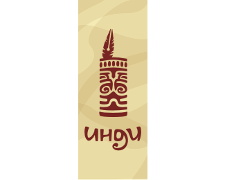
Indi
by Spavvic • Uploaded: Jan. 12 '10 - Gallerized: Mar. '10

Float
(Floaters:
64 )
Description:
Design studio «Indi» from Indians and, a little bit form «In Design» )
Revised
Status:
Client work
Viewed:
8209
Share:


Lets Discuss
I like this, floated the original version earlier, but when I look at it more and more I think it would work nice even without the feather! Stationery can be hot as lava here as well!
Replylike it! )
ReplyThis has a great feel to it. Nice work!
ReplyYes, very nice. I also agree about feather tho...
ReplyThank you )*As for the pen does not quite agree ) Without it boring.*It hints at the activity. Well, and what an Indian without feathers %22in the back%22 ))**The latest version here, if interested) *http://www.weblancer.net/files/portfolio/1402/140259/776137.png
Replyor here http://logopond.com/logos/051f55f9bdd9c274b51e7cc645a42bc1.png
ReplyI think you have to strong concepts fighting in this logo. The feather pen is awesome, but there are too many elements to figure out. I agree with type08 that the indian monolith speaks for itself. Maybe (and just maybe) you should keep one of this concepts for other logo. Nice work.
Replyvitor, may be ) But i can't imagine this totem without feather ))*thanks***Alen, thank U )*
Replynice mark!
ReplyI think it's amazing, agree with type08 it will look good also without the feather
ReplyThank U ) **Just look on it ))**http://s57.radikal.ru/i155/1003/f3/49e14c99e38e.png
Replyhaha as much as i can tell you hate it - it have to say i like the sans-feather better.**there is a lot of detail in that totem and the feather detracts from it.**if you really want to include it maybe try centering it and keeping the figure symmetrical? just an idea.
Replycobaltcow, thanks )
Replybooyah :)
Replyyeaah the darker version is much better i guess....:)
ReplyPlease login/signup to make a comment, registration is easy