Very nice. I like how you didn't go in the direction that most designers would be trying to incorporate flowers in there some where- It makes the logo look very high-end.
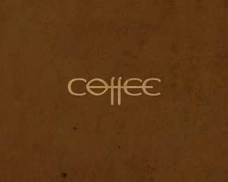
I really like the type. While the %22e%22 is interesting, I think it would be a little bit stronger if the stroke at the bottom of the %22e%22 didn't go up quite as far. This would help distinguish it from an %22o%22 (It looks like you probably modified the %22o%22 to make the %22e%22 to begin with.) Nice work, though.


Lets Discuss
Love the 'et' ligature.
ReplyAgreed. Great type on this one! The placement of the %22flowers%22 seems a bit off...
Replythanks guys
ReplySame font as your Oliwosi huh? noticed the e's and o's :)
Replybut the l gave it away just skewed. Ids that custom type just curious as it works quite well both ways.
Reply@logomotive: Yes, you are right, this is the same font. Only the %22e%22 in violetCE, it is an inverted %22CE%22 :)
Replysorry*...%22e%22 in violeto, it is an inverted %22o%22
ReplyYes you are right, this is the same font. Only the %22e%22 in violeto, it is an inverted %22o%22
Reply%25)) does not make it out to the system...
Replywell really good job on making both work quite nicely.
ReplyQuite nice.
ReplyNicely done again, bigoodis.
Replyawesome type Ivan!
Replythanks guys :)
ReplyGreat type indeed!
Replygreat logo
Replywow.. perfect idea ... i like it
ReplyThe typography here is top notch. Love it.
Replythanks guys*
ReplyLooks great!
ReplyVery nice. I like how you didn't go in the direction that most designers would be trying to incorporate flowers in there some where- It makes the logo look very high-end.
ReplyOh very nice! As a young designer, which typeface was your inspiration for this logo?
Replythnx guys :)*@artbee15: logo placed on the basis %22Mousse Script%22.
Replyvery flowerish :) love the type
ReplyKrutie logotipi v portfele!
Replyoy, spasibo!) tolko ychys poka
ReplySmells good! Good work.
Replythanks, mfrank :)
ReplyThanks a lot Alena :)
ReplyI really like the type. While the %22e%22 is interesting, I think it would be a little bit stronger if the stroke at the bottom of the %22e%22 didn't go up quite as far. This would help distinguish it from an %22o%22 (It looks like you probably modified the %22o%22 to make the %22e%22 to begin with.) Nice work, though.
ReplyThanks a lot Adam :) *For your comments and suggestions, it helps the other way to look at the works :)
ReplyBeauty
ReplyThanks James
ReplyAmazing type!
Reply%5E%5Eyes it is!
ReplySelected for volume 7 Logolounge book:)
Replycongrats, again, Ivan. :)
ReplyPlease login/signup to make a comment, registration is easy