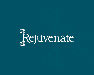
rejuvenate
by danny • Uploaded: Jan. 07 '10

Float
(Floaters:
3 )
Description:
WIP - Holistic company. Comments welcome :)
As seen on:
springnet
Status:
Client work
Viewed:
2035
Share:

Lets Discuss
I like this one the best... That is, it is good for signage and such. The reason I like it better than the green background is because it stands out much better - it's more free flowing - and that is something I would want to see in a logo that involves flowing curls. The knockout in green makes me feel as though the curls are constricted or cut out of a mold.**I like this... Nicely done :-)
ReplyPlease login/signup to make a comment, registration is easy