University of Agriculture
by Type08 • Uploaded: Jan. 07 '10

Float
(Floaters:
24 )
Description:
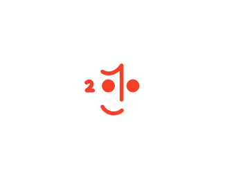
Logo proposal as a part of the new UOA branding system.
Status:
Unused proposal
Viewed:
7632
Share:


Lets Discuss
What if you flip the carrot so that it's pointing up and has the shape of an A...
Reply%5E I think you might lose a lot of the immediate carrot association that way.
ReplyHey guys, thanks for looking in. Yeah, the carrot idea is important here and the check mark at the top of it as well.
ReplyAlen I'm finding more and more that I shouldn't question you, and that you know best!
ReplyNice one Alen! What if you put serifs on the letter 'U' in the mark so it would remind more of an earth in which the carrot is growing? Just an idea. Keep up the great work!
ReplyJoe, I definitely don't know the best but always giving my best when it comes to meeting project specs and guidelines. You and I know that we can't always count on 100%25 creative freedom and any designer who claims that he/she has it is lying. Maybe in some personal work or those made 'for fun' but when it comes to real deal it is normal that client has a right to have preferences and opinion...*Dalius, thanks buddy, this will (again) sound as one more reject of a really nice idea. But I probably have a strongest argument so far - the U with side serifs is not really popular icon in our country since we had some paramilitary forces in our history who used that as their symbol. For that reason (I did a small analysis of domestic branding with a bunch of experts a year ago) people are also avoiding brand names starting with that letter, believe it or not. And also one more thing, the translation of the name is 'Poljoprivredni fakultet' but we went with the international (English) approach because of the huge plans university has when it comes to communication with EU.*Guys, thanks to both of course, very valid points here!
ReplyYeah, Alen, thanks for explaining. Once again, really nice concept here!
ReplyYes but a concept can be improved on?
ReplyOf course it can Mike, I didn't ditch any ideas of that kind but only those that were considered before posting the logo here (as I explained that before to you as well). Joe's idea - nice - but opposite to specs, Dalius' idea - meganice - opposite to perception of the whole country. I have a feeling that you have a pick on me mate, am I right? Always waiting in a bush for my 'mistake'...
ReplyAlen, no I have no pick on you. Why would you say that? But what I do see is you don't listen much to other designers.I see improvements that can be made but I will never comment again after seeing your comments back. I guess you have %22arrived%22 and don't need any constructive critique. I learn something new everyday because I listen to how others view my work.
ReplyVery clever Alen...test beaker, food, check/leaf. I'd say its a home run!
ReplyMike, ?!?! I just explained why I didn't go with those ideas but also thanked guys for opinions. I'm confused man.......*Fabian, thanks buddy, don't know what else to say after above comments...
ReplyPlease login/signup to make a comment, registration is easy