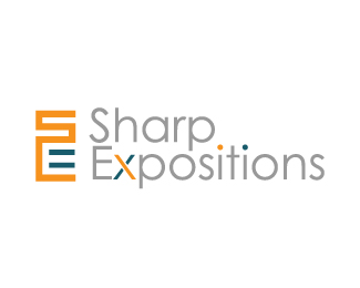
Sharp Expositions
by Lock_Designs • Uploaded: Jan. 06 '10

Float
(Floaters:
0 )
Description:
A logo designed for a expo exhibit production company. The mark is supposed to look like expo booth walls from above.
Status:
Unused proposal
Viewed:
5813
Share:


Lets Discuss
Yep, while very nice, this style can only be used for a couple of logos without making them all look the same. And Bart's logo is not alone already.
ReplyBut does it get its point across? It doesn't really matter the client went with another design, but I liked the two I posted more.
ReplyPlease login/signup to make a comment, registration is easy