Auto
by CommunicationAgency • Uploaded: Jan. 01 '10

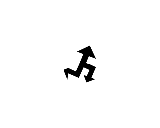
Float
(Floaters:
6 )
Description:
Logo design for internet car magazine and portal called Auto.
As seen on:
Auto moto
Status:
Client work
Viewed:
4559
Share:


Lets Discuss
i like this, neat stuff
ReplyThis is pretty neat.
Reply%5E%5EI do no quite agree, but i think the potential is here. I see the %22A%22 but i also see the front of a car, witht the two bloobs as headlights (don't know if the was intended?) I think this could turn out great with a little refinement.
ReplyThanks guys tree symbols you can see it is offcourse very dynamic swatch A, then futuristic car symbol with styles tyres bloobs in front black smaller and bigger at end. Yes there is also what Alexander see birds perspective of front of car with two bloobs which are carsmirros. Inspiration was question how to drow with onemove sketch dynamic swatch of car.
ReplyI don't know which is more confusing,.. Your definition of,.. or the logo. I get neither to be honest.
ReplyNobody confused. Client is very satisfy, they made research of 15 logos and all their competitors logos was incuded, this modern elegant logo people liked most. Everybody can see what he want to see. When we made logos client always want research how people see logos and their brand on sample N%3D200 or N%3D500. Cheers
ReplyI don't quite understand you explication fully either, but the shape is clever in my opinion. And goes out of the classic car shape used in logos cliche.
ReplyThanks a tass.*I agree symbol is clever and it is not cliche.*Inspiration idea was siluete of futuristic car symbol (As I see car in year 2100) and A swatch.
ReplyUpdate of Automoto colours.
ReplyPlease login/signup to make a comment, registration is easy