Colossal
by stylorogue • Uploaded: Dec. 25 '09 - Gallerized: Dec. '09

Float
(Floaters:
103 )
Description:
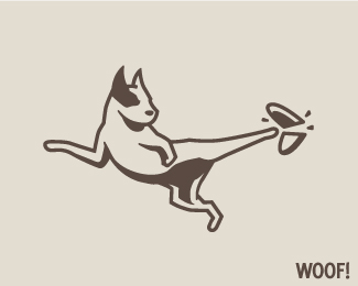
Logo for a photography/film studio
Status:
Just for fun
Viewed:
33013
Share:


Lets Discuss
Just beautiful!
Replynicely done
ReplyAgain, nicely done! :)
ReplyGreat work Stylo
Replywow!
Replyreally cool idea mate
Replyha this is awesome
ReplyHear the roar of the crowd...no to the lions here...kudos!
ReplyInteresting idea but I'd be lying if I said it was visually appealing.
ReplyWow, this is great!
Replyshould the thinner portion not have the 2nd row of sprocket holes?*
ReplyI'm with Jard on this one
Reply%5ESame.
ReplyLooks colossal, well done.
Replygood work!
Replyinteresting thought nice font selection as well ....
ReplyUnfortunately this was already done here in Croatia: http://www.pulafilmfestival.hr/hr/index.php*I don't suggest this to be a rip off just to let you know... :(
ReplyReally well done.
ReplyI love this logo! Well done.
ReplyThanks guys :)
Replylove it, it is certainly very appealing :)
Replyif you didn't just make this up and designed this for a client, I love it!
ReplySensational
Replyfantastic idea
ReplyGreat work!
ReplySuch a great mark.
ReplyThis is just so powerfull!! :) nice mark
ReplyBrilliant idea, and well executed too. Did you try a sans serif font? I'm not sure, but it might work better with the clean lines of the image..
Replyvery nice logo.
ReplyI think the serif typeface lends itself better to the historic vibe of the icon, so I'd keep it.**Nice work!
ReplySmart...Great ideas
ReplyEpic..
ReplyPlease login/signup to make a comment, registration is easy