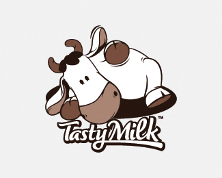
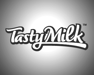
Tasty milk
by fantomachine • Uploaded: Dec. 18 '09
Description:
logo for imaginary dairy products comp
Status:
Just for fun
Viewed:
5929
Share:

Lets Discuss
I like this logotype a lot and personally think that it would work very nice without the mark (cow mascot) or in case if the mark was downsized by at least 75%25... Just my opinion, nice work!
Reply%5Eagreed. I think the type is pretty strong. I would lose the mark entirely or create a new one. The only thing I think of is, even though I see no udder, this cow seems to be pleasuring himself and trying to get to his %22tasty milk.%22
ReplyI agree with both of these fellas. The cow kind of looks like he's dying and bleeding chocolate milk.
Replybeautiful type, would bring it out even more if the cow was half the size it is now.
ReplyPlease login/signup to make a comment, registration is easy