HUNTERRACE
by vasvari • Uploaded: Dec. 16 '09
Description:
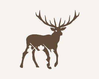
HUNTERRACE= HUNTER+TERRACE
New Awards: LogoLounge Vol. 6., The International Logo Design Award Hiiibrand 2010, Bronze Award. etc.
As seen on:
http://petervasvari.com
Status:
Client work
Viewed:
16405
Share:
Lets Discuss
Nice combo of hunters/elk.**Just curious and again I don't know what you've tried. I think one hunter in the white space would do justice. 3 is over kill and it makes all the legs look weird. Remove the white eye...it's frightening.
ReplyI'd hate to be that guy in the back.
Reply%5EHaha Glen.
Replylol
Replyhave you tried it without the eye? Thats the only thing that distracts me. Its a good concept.
ReplyThe flow of the men are drawing my eye toward the butt.
ReplyYeah, the hunters do look like they're...from Liliputt, and by the deer's rear-end. One hunter by the front is fine. The rest of them throw off the proportion of the design.
Replyfrom a hunting standpoint, having three gunning for the same animal usually leads to someone getting shot or a shot up elk.
ReplyPerfect)
ReplyThank you very much for your comments, I appreciate!
ReplyAmazing :)
ReplyThank you Mickael :)
ReplyGreat use of negative space!
ReplyPlease login/signup to make a comment, registration is easy