sublink
by sublick • Uploaded: Mar. 24 '07

Description:
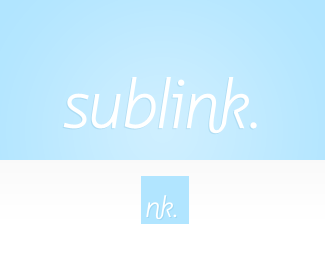
A logo for my projects site (sublink.ca). Pretty much just a straight font, with a little link between two of the letters. Is the smaller version recognizable as the same mark?
As seen on:
sublink.ca
Status:
Client work
Viewed:
1433
Share:


Lets Discuss
love the type treatment - it really is restrained elegant work - though i don't reckon the 'nk' mark works if they were to be used seperately..
ReplyPlease login/signup to make a comment, registration is easy