WP Monogram V2
by Logomotive • Uploaded: Dec. 10 '09 - Gallerized: Dec. '09
Description:
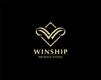
WP monogram. Same concept applied as version 1 just executed differently. The client thought original was too masculine. This production Co. mostly caters to Weddings AKA Winship Productions/Wedding Planners, so the WP monogram works as both which is kinda cool. This mark will probably be best for client if they do choose.
As seen on:
www.logomotive.net
Status:
Client work
Viewed:
16370
Share:


Lets Discuss
Very nice, suttle, classy monogram, I think this one is the best!
ReplyNicely styled, dude.
ReplyThanks Floris and Doc Oc. More Wedding Planners anyhow now. Sometimes it's good to get rejected. There's a 2 in there also (stretching the concept %3B) for %22wedding/couples%22 tried to give it a little ring flare too.
Replythis one is definitely more elegant. good for you
Replythis one is better
ReplyAgreed. This fits the clients business better.
Replyagree with the others. Nice work Mike
Replylove it
ReplyMuch better than the last. To be honest, I didn't really enjoy the last one(I know, I suck.) Is the actual name Winship? Or is that just a FPO name? The reason I ask is that I like the top of the diamond looking like front of a ship and splitting the water into waves forms the W. I only have one tweak and it may just be monitor, but the spacing between the two %22swashes%22 is slightly bigger on the right side than the left. Have you tried a more ornate diamond shape instead of geometric? Just curious. Nice to see other variations. Good luck. I hope the client approves.
Replyi prefer this one, it shows great elegance, well done
ReplyThanks guys, clients worried about the %22average joe%22 not seeing the WP though. IMO I see a large W on initial, but I designed it. They get it it but worried that others will not... so still a WIP.
ReplyI thought 'Winship' is not aiming on 'average Joes'... I guess I was wrong...
Reply%5Eyeah hard to keep inspired when you get let downs and hear stuff like that. Need to do a little preaching about logo design and why we don't throw the kitchen sink in design and why sometimes aesthetics takes precedence over someone slapping together a WP and calling it a logo.
ReplyMike, I thought this was the challenge: Client's main goal is a good memorable monogram.**They are getting exactly that IMO, and, who cares about what people see in a mark although I see the WP clearly, they should give 'average Joes' more credit. Sorry to hear that Bud.
ReplyRudy, thanks for your support. We need that sometimes :)
ReplySome clients can be a PITA at times%3B creative control and all that. It's a shame.
ReplyExactly what Rudy said. Some clients, man. The mark is beautiful regardless if you can see the W/P.
ReplyFavourited!!
ReplyThanks guys, client chose this design after all %3B)
Replythanks Dalius, lucky to have this client too.
Replynice too hear that! one of the clever clients.
Reply%5E :) my clients are all clever, just not always design wise %3B)
ReplyAlways liked this one, Mike. Nice work.
ReplyPlease login/signup to make a comment, registration is easy