RH
by Wizemark • Uploaded: Dec. 10 '09

Float
(Floaters:
49 )
Description:
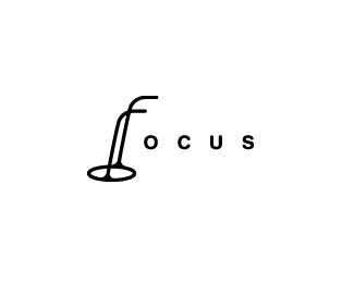
It`s a still work in progress. Guy is a coach and he`s basically dealing with ppl that just starting out with running. Logo should be attractive to both males and females.
Status:
Client work
Viewed:
9429
Share:


Lets Discuss
It can be quite difficult creating a unique, yet simple figure. This one works well.
ReplyThanks, Kevin. It can be quite difficult, ye. And this one really was..from something that was more like a turtle showing with hand to the right to this was quite a long process.. :)
ReplyIt has motion, well done.
Replyand good type as well.
ReplyThanks, Rudy %26 Milosz!
ReplyThe mark is excellent, but the double N in the name looks a bit cliche, I don't think it's adds anything to the logo, more like the opposite.
ReplyLove it, *
ReplyPretty cool, I like the style of the figure a lot.
ReplyAnthony, Rincon %26 Sean, thanks!*Alex, i wanted some unique tweak on the type as well. It%60s not final yet, but it has some heart rate graph/wave feel to me, and that can be a nice add to the theme, i think. Anyway, thanks for your input. I appreciate it!
ReplyFantastic! It has great movement, loving the leaning forward as he's about to cross the finishline.
ReplyThanks, Fabian!
Replygreat. i love how the mark looks. very simple and effective. congrats!
ReplyGreat flow! Very nice!
ReplyThanks a lot Andrei, Michael %26 Dalius!
ReplyVery nice.
ReplyThanks, Julian!
Replygreat style
ReplyNice idea!
ReplyVery good execution!
ReplyLike this Srdjan, nice work.
ReplyThanks a lot, guys.
Replyhas a lot of energy. really nice style. way to go Wize. :)
ReplyCheers, Mikey! :)
ReplyPlease login/signup to make a comment, registration is easy