by SimonFenix • Uploaded: Nov. 15 '09 - Gallerized: Nov. '09
Add to Pad (In 27 Pad s )
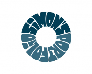
Description: Finance, Banking Status: Client work Viewed: 30368 Share:
I'm loving your type work! Really solid stuff!
Thanks!
congrat for being in the gallery
FREEEEEDOM!!!:)
THAAAANKS!)))
Looks nice but I see no relation to finance or banking. What is it for?
youth banking cards program (sorry about English)
ooh nice!
The style is nice and seems appropriate enough for a youth program, but something about the ambiguous shape the logotype creates seems slightly awkward.
I just saw this campaign:*http://www.moneyfest2009.nl/*coinsidence? :-)
YES! I saw it at the first time))))
Looks good!
love your works*
Please login/signup to make a comment, registration is easy
Follow


Lets Discuss
I'm loving your type work! Really solid stuff!
ReplyThanks!
Replycongrat for being in the gallery
ReplyFREEEEEDOM!!!:)
ReplyTHAAAANKS!)))
ReplyLooks nice but I see no relation to finance or banking. What is it for?
Replyyouth banking cards program (sorry about English)
Replyooh nice!
ReplyThe style is nice and seems appropriate enough for a youth program, but something about the ambiguous shape the logotype creates seems slightly awkward.
ReplyI just saw this campaign:*http://www.moneyfest2009.nl/*coinsidence? :-)
ReplyYES! I saw it at the first time))))
ReplyLooks good!
Replylove your works*
ReplyPlease login/signup to make a comment, registration is easy