sea
by ideoma • Uploaded: Nov. 14 '09 - Gallerized: Dec. '09
Description:
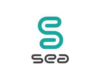
This logo intention is to create an "S" using the shapes of the letters "e" and "a" thus the mark contains all the letter of the word "sea". The wavy geometry of the mark is also quite pertinent relating to the idea of sea.
As seen on:
http://www.logotipo.pt
Status:
Just for fun
Viewed:
7546
Share:


Lets Discuss
Ilike it%60%60
ReplyThe mark is great and simple, but the type is really not working for me.
Replythe mark has all the letters in it..cool one
ReplyAgree with alexanderspliid. The mark is wonderful, but the type seems unbalanced... almost as though it's leaning or tilting.
Replyits nice but maybe hard on the eyes
Replythanx for the coments, we didn't spend much time perfecting it, the mark is formed by the letters in the title so we were conditioned by it. Could be improved no doubt %3D)
Replywe are thousands of logo design obsessed minds hence teh coincidential ideas! %3D) a minute ago i was checking designboom and saw an exact replica of a winter scarf inspired in a tie that my girlfriend made for me for winter in 2007 xmas! it's insane to think that we are the only ones having this ideas! *cheers
ReplyPlease login/signup to make a comment, registration is easy