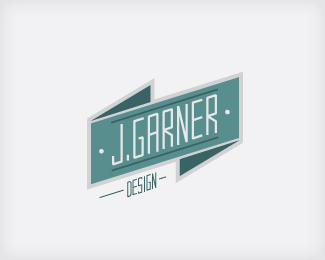
Seeing Double
by jgarnerdesign • Uploaded: Nov. 14 '09 - Gallerized: Nov. '09

Float
(Floaters:
86 )
Description:
Logo for a film studio.
Status:
Just for fun
Viewed:
40325
Share:


Lets Discuss
Love the idea! %3B) Nicely done!
ReplyI like this better, because the typography looks more like a vision test*I like it :)
ReplyNice. I wonder if it works good looking at it with 3d glasses
ReplyLove this one...gave me a headache tho XD
ReplyVery cool. Love it.
ReplyYeah cool!!
ReplyNice execution. It could also be a 3D Film Festival, 3D is the (old) new trend!
ReplyFantastic idea. *The glasses and text seem a nit un-balanced though (glasses could shift left a bit).
ReplyDope! That should read %22a bit%22 not %22a nit%22. Pays to proof your comments before hitting post : )
ReplyI love this
ReplyLooks very good.
ReplyI love this one! Great job!
ReplyI've seen avatars done in this style on at least two different and unrelated forums. Just an FYI, the concept is not 100%25 original.
Replyfantastic idea and execution! Love it.
Reply@epsilon%3E this style was invented at least 60 years ago not now.. jgarnerdesign did a really great job using this style with the right colors, the right idea and the right execution.. love it!
Replynice, like the style
Replywhere's my 3D glasses, i wanna see if it actually works!**haha, awesome one.
ReplyWell done.
ReplyNIce.. reminds me of the original %22Bunny' logo version. But ideas influence %3B)
ReplyGreat mark. Love the colors, the shape of the glasses and the perspective. Really well done.
ReplyPerfect idea, perfect layout, perfect colours, perfect font. Perfect!
ReplyThank guys. I appreciate it. The identity system is coming along nicely for this. Including custom 3-d glasses with the paper system, really makes certain things pop.
Replywas this done as a vector? looks good - just wondering if you designed a one color version as well...
Reply%5E Thanks. It is vector, and I do have a 1 color gray-scale version.
Replywould look great as a film poster too. 10/10
ReplyGood execution. Great for 3D cinema!
ReplySweet! Great idea
Replyawesome job
ReplyWhat a really smart idea!
ReplyHi! Any way can we use this for our starting Film Studios? We are a bunch of college students and this logo particularly piqued our interest. Would like to talk to you, thanks! VERY AWESOME WORK!
ReplyPlease login/signup to make a comment, registration is easy