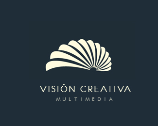
just one thing... it looks to similar with fresh media, your logo from the showcase. Maybe you can use here different colours to create a dreamy atmosphere
Phane,it looks similar to fresh media because I have used the multiply effect technique in both of them.I tried it with different colors but found it most appealing in this color pallette i.e why stuck to it.Thanks for the feedback guys:)
I agree with Phane, but not because you used the same design. When I think of a lullaby- I generally think of night, sleepiness, dreams..etc. This is more of a lively, excited color scheme. I would recommend using blues and grays, but that's just imo. It still looks fantastic.
You are absolutely right Chad and I completely agree with your point of view.Since the logo was designed keeping a creative studio in mind i.e why the use of multiple colors.But I have uploaded a newer version in a slightly muted color pallete.Thanks a lot for your feedback.


Lets Discuss
Lovely colors...great work.
Replyjust one thing... it looks to similar with fresh media, your logo from the showcase. Maybe you can use here different colours to create a dreamy atmosphere
ReplyPhane,it looks similar to fresh media because I have used the multiply effect technique in both of them.I tried it with different colors but found it most appealing in this color pallette i.e why stuck to it.Thanks for the feedback guys:)
ReplyLooks beautiful !
ReplyI agree with Phane, but not because you used the same design. When I think of a lullaby- I generally think of night, sleepiness, dreams..etc. This is more of a lively, excited color scheme. I would recommend using blues and grays, but that's just imo. It still looks fantastic.
ReplyYou are absolutely right Chad and I completely agree with your point of view.Since the logo was designed keeping a creative studio in mind i.e why the use of multiple colors.But I have uploaded a newer version in a slightly muted color pallete.Thanks a lot for your feedback.
Replyi think this is very nice
Replythanks logocrave!
Replyreally like it :). I asume you use Illustrator, what exactly do you mean by multiply effect technique, i guess its the multiply layer effect ?
ReplyFeatured here:
Reply20 Creative Moon Logo Designs for Inspirations
Please login/signup to make a comment, registration is easy