by milash • Uploaded: Nov. 05 '09 - Gallerized: Nov. '09
Add to Pad (In 103 Pad s )
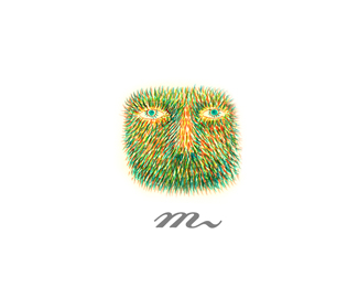
Description: French Bread Bakery Status: Nothing set Viewed: 25416 Share:
This soooooo good! I am loving it.
It is great. Loved the feel immediately!
o, wow. thanks
I think that if you flipped the mark you would gain a nice negative F over there, just a suggestion, other than that i really like it!
This does look great. I have to agree with kuentin though. This way I see an E more than an F.
nice logo, i think the text es too small
kuentin I tried. Unfortunately did not work. anyways, thanks for liking it
Oh bugger...I did this very design on paper last week...you looking over my shoulder?...lol...nicely done.
Very nice Milash**@fabian: That's happened to me before here on LP, too! It's uncanny...
i like this one :)
Good idea! Thats great!
Baguette while you can. Nice one, milash.
Tres bien, Milash! :)
Great work milash. This is fantastic!
well done dude this is tasty :)
Fantastic logo!!
i'm glad you all like it. thank you.
This is really good. Great execution on the mark.
Very strong concept. Though it seems like you rushed with the typeface after you created the wonderful symbol. Also I'd love to see the color scheme for this.
very nice logo, it looks so tasty :) *Reminded me of this one: http://logopond.com/gallery/detail/72718
Very clever. Simple and well executed.
Very very clever, Love it :)
Great logo - very tasty. Saw the French loaf straight away.
thanks gentleman
great one milash!
Another beaut milash, i'm starting to get very jealous of your gallery %3B)
THANKS TOMME. THANKS BIROFUNK. i appreciate it
pure class!
wonderful idea!*realy clever%3B)
Always liked this one milash.
thanks joe. thanks guys.
wow...i'm was 5555 viewers! :D
Clever idea, I love it :)
Very clever idea :)
Like the ideal solution!
Just so perfect. Your show case is out of this world milash!
thanks orca.i appreciate it
brilliant idea, beautifully executed
Always loved this one!
great logo
Great love, I am loving it.
Please login/signup to make a comment, registration is easy
Follow


Lets Discuss
This soooooo good! I am loving it.
ReplyIt is great. Loved the feel immediately!
Replyo, wow. thanks
ReplyI think that if you flipped the mark you would gain a nice negative F over there, just a suggestion, other than that i really like it!
ReplyThis does look great. I have to agree with kuentin though. This way I see an E more than an F.
Replynice logo, i think the text es too small
Replykuentin I tried. Unfortunately did not work. anyways, thanks for liking it
ReplyOh bugger...I did this very design on paper last week...you looking over my shoulder?...lol...nicely done.
ReplyVery nice Milash**@fabian: That's happened to me before here on LP, too! It's uncanny...
Replyi like this one :)
ReplyGood idea! Thats great!
ReplyBaguette while you can. Nice one, milash.
ReplyTres bien, Milash! :)
ReplyGreat work milash. This is fantastic!
Replywell done dude this is tasty :)
ReplyFantastic logo!!
Replyi'm glad you all like it. thank you.
ReplyThis is really good. Great execution on the mark.
ReplyVery strong concept. Though it seems like you rushed with the typeface after you created the wonderful symbol. Also I'd love to see the color scheme for this.
Replyvery nice logo, it looks so tasty :) *Reminded me of this one: http://logopond.com/gallery/detail/72718
ReplyVery clever. Simple and well executed.
ReplyVery very clever, Love it :)
ReplyGreat logo - very tasty. Saw the French loaf straight away.
Replythanks gentleman
Replygreat one milash!
ReplyAnother beaut milash, i'm starting to get very jealous of your gallery %3B)
ReplyTHANKS TOMME. THANKS BIROFUNK. i appreciate it
Replypure class!
Replywonderful idea!*realy clever%3B)
ReplyAlways liked this one milash.
Replythanks joe. thanks guys.
Replywow...i'm was 5555 viewers! :D
ReplyClever idea, I love it :)
ReplyVery clever idea :)
ReplyLike the ideal solution!
ReplyJust so perfect. Your show case is out of this world milash!
Replythanks orca.i appreciate it
Replybrilliant idea, beautifully executed
ReplyAlways loved this one!
Replygreat logo
ReplyGreat love, I am loving it.
ReplyPlease login/signup to make a comment, registration is easy