by Luiz_adelino • Uploaded: Oct. 27 '09
Add to Pad (In 2 Pad s )
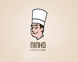
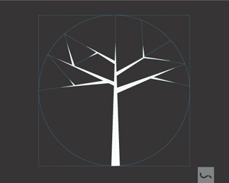
Description: Logo for a Cheff Status: Client work Viewed: 2572 Share:
Out of all four, I prefer this one. It has a nice balance between the font weight and the thickness of the keyline around your illustration. Well done!
I agree completely with wiking. This is the best of all of 'em, best balance, best feel.
Nice, great font selection. Works quite well
this is the one, great typeface
agree with all of the above :D
thanks guys, i prefer this one too
I like this guy!
Please login/signup to make a comment, registration is easy
Follow


Lets Discuss
Out of all four, I prefer this one. It has a nice balance between the font weight and the thickness of the keyline around your illustration. Well done!
ReplyI agree completely with wiking. This is the best of all of 'em, best balance, best feel.
ReplyNice, great font selection. Works quite well
Replythis is the one, great typeface
Replyagree with all of the above :D
Replythanks guys, i prefer this one too
ReplyI like this guy!
ReplyPlease login/signup to make a comment, registration is easy