UP
by florisvoorveld • Uploaded: Oct. 26 '09 - Gallerized: Oct. '09

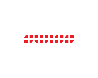
Float
(Floaters:
86 )
Description:
I know there are some like these, but this idea was stuck in my head and needed to get out.
*update: sold!
Status:
Client work
Viewed:
35859
Share:

Lets Discuss
coool
Replyway to get it out.
ReplyThat looks great man!
ReplyA little inspiration from a certain someone...? Anyway, I like it.
ReplySimply wonderful.
ReplyHaha I love the description
ReplyOhhh .. the sequel that doesn't suck. This is really nice, dude.
Reply@Jared I wanted to save you the effort... then again there are some similar, but as far as I know there aren't any like this**oh and thanks everyone :)
ReplyHehe nah this is my favorite UP logo I've seen I think. Surprisingly legible and a wonderful use of negative space.
Replywow!... awesome!... bikini %2425!...
Replyyeah, and look at those sunglasses.. wow!
ReplyThis is superb - like it. :)
ReplyIs a very good synthesys. excellent!*I wish you see my showcase and write some words. Thanks!
ReplyIt's pretty cool. Though I wonder what's the concept behind it.
ReplyNice one Floris!
ReplyImpressive!
ReplyThis is greaty. Really really love it. It is really awesome job I love negative space:)
Replythank you peeps
ReplyAt first it's like what the? Then it becomes very clear and smacks you in the face like a wet fish.
Replyi finally realized what is the concept after i see the bigger version, awesome!
ReplyI love it.
ReplyEasy cool!
Replyvery nice
ReplyThank you all :D
Replythis is simply superb man... loved it
ReplyPlease login/signup to make a comment, registration is easy