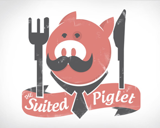
The suited piglet
by kylemac • Uploaded: Oct. 18 '09

Description:
:)
As seen on:
www.kylemac.com.au
Status:
Student work
Viewed:
5181
Share:


Lets Discuss
The pig is awesome. Cutlery needs more work. Also reduce the size of the logo.
Reply%5E Exactly what I was thinking. I don't think there's any need for those odd notches in the silverware, clean up the sharp edge of the knife, then make the fork prongs even. Also, you may want to go ahead and center the pig head inside the collar. It's slightly to the left as it is.
ReplyPlease login/signup to make a comment, registration is easy