The Whitewashers
by ChadSanderson • Uploaded: Oct. 17 '09
Description:
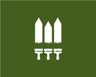
A current WIP for an outdoor maintenance company. Paint/fence. And a w!
Status:
Unused proposal
Viewed:
6776
Share:




Lets Discuss
Great %3B) maybe a wee bit more grass/brush?
ReplyAwesome...what if you slightly shorten the middle picket to really sell the W?
ReplyLooks great man, second what mike said :)
Replyyes agree what fabian and mike said, if you shorten it will be more of a w and the brushs do need to be longer**but great concept!
ReplyAlright guys, thank you! Just what I was looking for. I'll get on that.
Replyagree with the above, but really, really great concept. good work!
Replyvery nice!
ReplyComing along nicely, bud!
ReplyYeah i also agrre with logomotive and brandsimplicity, but very cool
Replyliking this a lot :)
Replyvery nice concept, the grass is conveying to the bristles of the brush too*
ReplyThank you everyone! I went with the majority opinion and lowered the middle fence post to better make the 'w' shape, and made the bristles more pronounced. Still refining, but thanks so much for the help so far.
ReplyZuper
ReplyThe bristles could be taller to feel proportionate to real brushes. All you need to do is drop the handles down a bit.
ReplyI think the fence should be all the same height and the paint brushes slightly different height of stroke (middle one) and look a little more like brushes than grass?
ReplyComing along nicely! I personal like Mikes idea of making the grass more brush like, maybe adding a tad more brush height?
ReplyChad this idea is FANTASTIC and you're getting great advice above. Very impressed.
ReplyAnother nice one Chad. Keep it up fella.
ReplyBeautifully done
ReplyThanks so much for the feedback everyone, and I'm working on modifying it more as we speak. And the advice is fantastic. You guys are awesome.**And @absoludicrous: Well, they're saved at 72 dpi. But that's just what the site regulations are, I thought. I could be wrong though. But thank you for the look!
ReplyMade the grass resemble a brush more and extended the height slightly. The client really liked this concept (For once!), so I'll start working on the type to go with it. Thanks again everyone, for the floats and the advice.
ReplyAh, I see. That's interesting, because they are definitely saved at 100. Unless I was too hasty. Or something.
ReplyThank you lalo! I appreciate it.
ReplyNice one Chad, very nice.
ReplyThis logo makes me so happy! You killed it!
ReplyYes, and even great fact it's for an actual client. Bigger Kudos.
ReplyWell done Chad, looks amazing!
ReplyGreat work Chad, love the simplicity of it all.*
ReplyThank you rudy, chirp, logomotive, brandman, and RGD. You guys make my day.
ReplySlight, and unfortunate update. After a few emails back and forth with the client, they told me quite suddenly they had decided to go with another designer because their wives didn't like the design. But thanks for all the advice in development guys. On to the next project, I suppose.
ReplyTheir loss Chad.
ReplySorry to hear that, Chad. Comes with the territory, I suppose. Their loss.
ReplyDude...that's such a shame, you totally killed this:)
ReplyTheir loss, dude. This is a great solution.
ReplyThis will not be the first time a good solution is rejected Chad, one thing you can learn from all this... Design for the wives :)
ReplyReally liking this. It works instantly and has a playful approach that keeps you appreciating it. Great negative space.
ReplyReally nice! :)
ReplyThank you for the kind comments everyone. It was disappointing, but I'll hold on to it on the half odd chance something similar ever arises.
ReplyChad, you are young, and have a great future ahead, I'd say reuse it and sell it well, it's a great logo and you'll come up with more I'm sure.
ReplyI like it, nice one bud!
ReplyThanks fellas. As long as you guys are around to inspire me, then the future looks bright. (Now all I need is some triumphant music. :D)
ReplyThanks for your support. The matter of making something which is already out there, very similar, always scares me. But I guess it's something we all have to deal with :) Great job on your gallery!
ReplyThat's very true. But I think as long as we remain humble and understand we probably were not the first ones to do anything, that makes it a lot easier to move on. And thank you!
ReplyGreat job. I love the grass/paint brush/wet paint. I didn't see a %22W%22 right away, but once you mentioned it, it becomes clear.
ReplyHow could the client not go for this, it's awesome! As said above, their loss!
ReplyVery much appreciated guys! Yeah, I was a little off-put by that decision too. I would throw a brick through their window in retaliation, but I'm pretty sure they operate from a garden shed. (Violence is never good anyway.)
ReplyLove this thing.
ReplyThanks Danny!
ReplyAfter close to 9 months of being unused, this little guy is finally finding a home.
Reply%5ENice..*
ReplyCongrats, this needed to find a good home:)
ReplyOh, that's awesome buddy. Congrats indeed!
ReplyChadtastic!
ReplyGlad to hear that Chad, always loved this logo.
Replywhy is this not in the gallery?
ReplyThanks guys, I'm pretty excited about it myself.
ReplyExcellent portfolio :)
ReplyGenius logo. Great showcase!
ReplyThanks for all the nice comments Simon. I really should start updating more.
ReplyReally great picture! Keep on the nice work.
Replyreally good one
ReplyPlease login/signup to make a comment, registration is easy