Bckspace
by JoePrince • Uploaded: Oct. 15 '09 - Gallerized: Nov. '09
Description:
Copyright © 2009 Joe Prince and Admix Designs.
As seen on:
Admix Designs
Status:
Nothing set
Viewed:
33468
Share:



Lets Discuss
jej... cool!
Replygreat idea!
Replynice! could do a series http://logopond.com/gallery/detail/65610*
Reply%5EHaha yeah. Thanks!
Replygreat concept!
ReplyThanks Fred!
ReplyThanks for the floats everyone.
ReplyVery nice momentum! Everything here looks perfect.
ReplyYeah, love the style.
ReplyAppreciate it Chad and Lecart!
Replybrilliant
Replyvery clever momentum!
ReplyThanks John!
ReplyClever ! and looks beautiful !!
Replyit's wnderful : )
Replybrilliant joe!
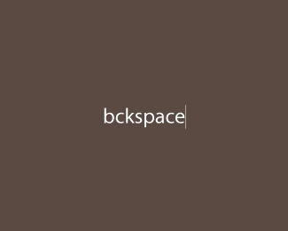
ReplyI like it, but perhaps the verticle line in between the B and C, like you actually backspaced... i dunno, just a suggestion.
ReplyWill take that into consideration. Thanks everyone!
ReplyExtremely simple and creative. Great!
ReplyMolodec! Kratkost' - sestra talanta!
ReplyLoved v.1. Ditto for v.2 : )
ReplyI love clever design.
ReplyThanks for the floats and comments everyone!
ReplyLove it - great concept and execution!
ReplyThanks, appreciate it.
Replylove it! it jst mkes me wnt to hit bckspace!**(I'm nt being cute -- I'm drnk)
Replyvery very cool
ReplyHaha thanks!
Replygood concept.
ReplyThanks Jpayne!
Replyvery cool. good job! %3B)
ReplyThank you Rick!
Replyvery interesting! :)
ReplyThank you big! :)
ReplyHa! Nice one Joe! :)
ReplyGot ripped by some guy from London. Sent him an email yesterday and still waiting for him to respond. Argh!*http://www.bckspace.co.uk/*http://bckspace.deviantart.com/
ReplyOh, man.. better not to comment..
Reply%3E:(
ReplyThe thinness of the backspace cursor is perfect, must of been tempting to beef it up a little...
ReplyThanks guys. The design was removed by the owner so hopefully this doesn't happen again. Cheers!
ReplyThis is simply ingeniously!!! Its hard to resist hitting it (the key).
Replyfabulous!
ReplyThank you all :)
Replytoo
ReplyVery cool logo, i love it!
ReplyIm wondering how it'd look if you put the line next to the b... eitherway looks good! Clever.
ReplyPlease login/signup to make a comment, registration is easy