Live for the Cure : Ribbon
by ohTwentyone • Uploaded: Mar. 09 '07

Description:
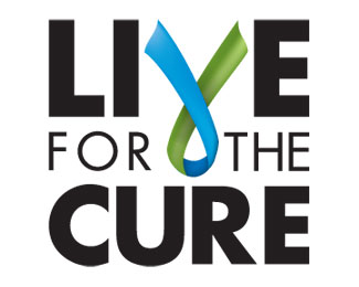
This is a concept for a logo that probably won\'t get used. The client is a group that raises money to help people with chronic illnesses pay for their meds. I know, the ribbon is overplayed, and it would be better if it were red, and I could do a million things to make it better...and I would if the client were to use it.
The client is hung up on the ribbon thing, and on green, and I mocked it up super fast. So, it is what it is.
*Update: This logo actually got picked by the client! After \"informing\" me that someone internal had \"designed\" a logo I thought this one would be sent to the netherworld of unused logos...but when the client saw it, they decided that there is, indeed, a reason to hire professional logo designers, and decided to keep it!
**This logo will be published in the upcoming book, "Designing for the Greater Good"
Status:
Client work
Viewed:
6057
Share:


Lets Discuss
I like it, very strong. *Although Jormi made a good point, this could be something to work against that. Because the ribbon upside down has a beautiful and very adequate symbolism in it. The 1st part going down is 'illness', the bottom part is the turn and contact with 'Live for the cure' and the 2nd part going up is 'recovery'. I like it.
ReplyPlease login/signup to make a comment, registration is easy