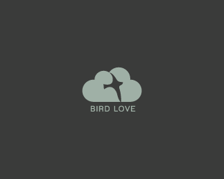
Bird Love (dk)
by Lecart • Uploaded: Oct. 13 '09 - Gallerized: May. '10
Description:
I know Logomotive already has a classic on this concept, but couldn't help not to publish it.
As seen on:
my portfolio
Status:
Just for fun
Viewed:
21332
Share:




Lets Discuss
Good work Lecart.
ReplyLoverly! I almost want to see a little more detail in the silouette to distinguish it as a bird. But wonderful none the less.
ReplyThank you! Actually i designed the bird on a cloud, but my girlfriend saw the heart shapes, and after some minor tweaks i came up with this. :)
ReplyLove it, but the bird's head could be refined a little.
ReplySame comment as firebrand ... but I guess that we have a winner. Hope to see it on LP Gallery
ReplyWow really nice, love the bird and the cloud of hearts. Nice job.
ReplyThank you for the comments and floats. @ firebrand, i'll keep that in mind for later revisions.
Reply2 similar concepts, 2 completely different executions. You've got my float.
Replygreat work mate!
ReplyGreat!!
ReplyThanks, appreciated! :)
ReplyYes, the bird head...other than that coolness:)
Replynice job
Replygreat work!
ReplyWhat's wrong with the bird head? it's a special bird, stop hatin'! Now seriously, i wasn't going for a detailed illustration of the bird, but somehow of a (bit) strange curves in harmony with the cloud shape. But then again you guys might be right, i'll try some tweaks, i'm just afraid it'll fly away. :D**Thanks for the floats %26 comments, much appreciated!
Replyvery cool Lecart
ReplyI think you've got a very nice result!
ReplyThanks tass, Stephen.
Replyclever, very nice %3B)
ReplyMy favorite in this showcase! :)
ReplyI love bird love
Replylove the idea. i would make the hearts stand out more, maybe two different colors and let them overlay. i would also define the bird a little better, maybe larger? great idea!
ReplyWhy do they hate the poor little bird? Is not a zoology book illustration. I think is nice mark. (Quite melancholic one.... but nice indeed)
ReplyWow, and I have similar work like this but the concept was a comb and cotton (from a sticker on my monitor - %22100%25 COMBED COTTON%22). I'm working on it right now.
ReplyGreat concept and work
Replynice idea ..
Reply֗D%uFF01
Replyun logo delicado y maravilloso
ReplySimple and Nice... perfect combination!!!
Replyvery nice )
ReplySimple, strong and effective.
ReplyI just say ... that is sooperb.... !
Replylovely logo :)
Replythank you all! :)
ReplyI see a bird in a cloud)
ReplyThumbs up for girlfriends, eh (: ?
ReplyGreat timeless design, love its simplicity!
ReplyThank you, I appreciate that!
ReplyPlease login/signup to make a comment, registration is easy