Home
Gallery
Activity
Creatives
Sign In / Register
Featured
Ink Screen Printing Logo
Proffalices
Float
Minimalist Bear
Leeyartdotcom
Float
Bakery
Miranchukova
Float
Café Gol
González
Float
Uema Logo
ImonUix
Float
Mototee
JohneryCreatives
Float
Spacewash
Kreatank
Float
Giraffe Milk Guide Logo
Proffalices
Float
rabrot
Ambi
Float
Tea Leaf Girl Logo
Proffalices
Float
Home Love Cares Logo
Proffalices
Float
Couch Corn
Mikylangela
Float
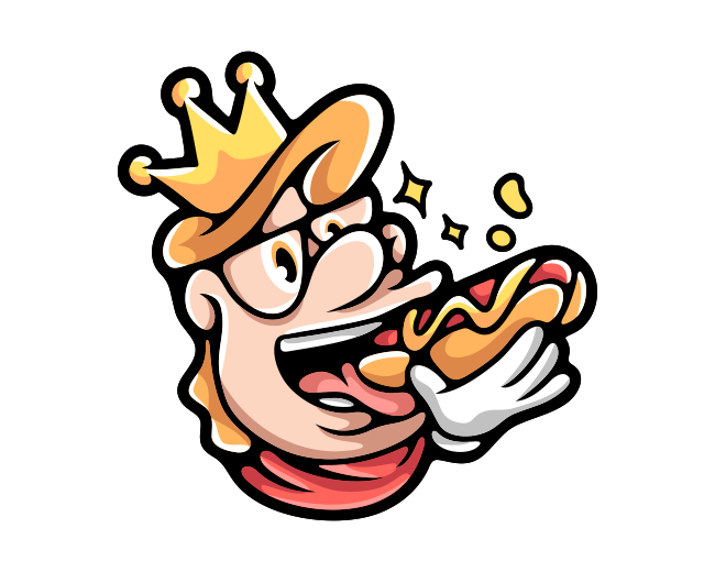
Friendly Hotdog King Logo
Proffalices
Float
Cannabis Skull
Costoboc
Float
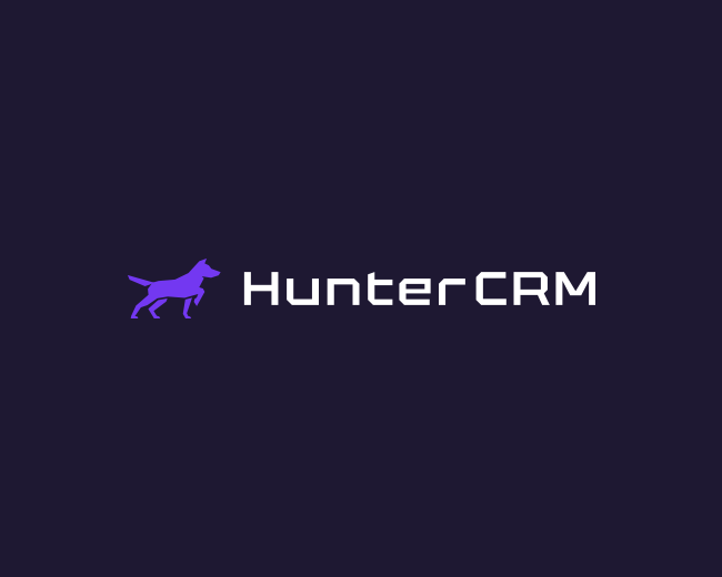
HunterCRM logo
BrandKing
Float
More
Featured Artist: ImonUix
Follow
ImonUix
Logos :
82
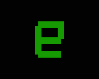
Letter E Nft Logo
ImonUix
Float
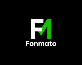
FM Letter Logo - Modern Minimal Logo - FM Logo
ImonUix
Float
Pharmacy Logo
ImonUix
Float
UH Monogram Logo
ImonUix
Float
Jenlaf Logo - J Letter Logo
ImonUix
Float
Hartical Logo
ImonUix
Float
Global Tech Logo
ImonUix
Float
W Letter Logo - Colorful Logo - Modern Logo
ImonUix
Float
Pentech Logo - P Logo Design
ImonUix
Float
Wemade - W Logo
ImonUix
Float
Doctor Logo - Health Care Logo - Telemedicine Logo
ImonUix
Float
Chat Logo
ImonUix
Float
Modern V Letter Mark Logo
ImonUix
Float
Unicart Logo Design
ImonUix
Float
Letter D Hand Logo
ImonUix
Float
Letter M Shield Logo
ImonUix
Float
Letter Mark Logo
ImonUix
Float
Monogram Logo
ImonUix
Float
Digital B Tech Logo
ImonUix
Float
Letter D With Dog Logo Design
ImonUix
Float
Recent Discussions
adamguma
great logo, simple and minimalist :)
Fairs1990
Nice pic here. You must visit
http://geometry-dashscratch.com
to have much fun.
jimkentom
I've been passionate about gambling for a long time, and I can say it's a great logo that[...]
udier1
Hello, everyone. I have been interested in sports betting for a long time, and I know a lot[...]
TomiChpak2
Hello friends, as a amateur gambling, I have been blown away by the variety and excitement of the[...]
mbmhealth
Hi there Younique I like this logo and would like to use it
More
Creatives
Gal
Follow
65 Identities
Following 0
412 Followers
Follow
Luigi1818
Logos :
54
Follow
costoboc
Logos :
413
Follow
Kreatank
Logos :
404
Follow
mylogos
Logos :
29
Follow
proffartline
Logos :
339
Follow
logoman
Logos :
206
Follow
mx19
Logo :
1
Follow
rimongraphics
Logos :
213
Follow
artology
Logos :
294
Follow
anhdodes
Logos :
422
Follow
Leal752
Logos :
5
Follow
sleem
Logos :
80
More
Logopond © 2006 - 2024
Contact: Management
|
Terms of Service
|
Privacy Policy
|
Advertise


.jpg)


great logo, simple and minimalist :)