RailPros
by peterehat • Uploaded: Oct. 09 '09 - Gallerized: Mar. '10
Description:
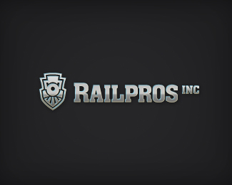
RailPros, Inc proposed logo.
Status:
Unused proposal
Viewed:
5980
Share:


Lets Discuss
Really!!!!! liking this one Peter. Maybe work on the boiler and windows more. Diggin it.
Replyseeing lots of potential in this mark.
Replyreally good ...
ReplyNice mark! Shouldn't 'P' be upper cased as well?
Replylooking nice
ReplyThanks for the feedback everyone. It's much appreciated! @Mike: It's funny you mention the windows--I've been tinkering a bit to make them not look so much like eyes, but at the same time I don't want to lose the thicker parts around it. Do you think the boiler needs more flare or something? @Alen: I had a version with a large P, but it looked imbalanced 'cause of the big space under the P. I'll bet the client comes back with the same feedback though.
ReplyStrong one - I really like this. **I do agree that the marks needs some fine tuning. The lower part (don't know the word for it - maybe the grill?) looks to flat. I'm missing some perspective/depth. Right now, I can't help to see dog with a shield in it's mouth :)**Anyways, great job.
ReplyLooks strong. Steel, heavy, like a train. Almost shield like.
Replyreally good concept. Maybe the type could be a tad smaller in relationship to the icon...
ReplyI'll defer to the resident Logomotive for any comments on this one.
Replysolid mark...awesome!
ReplyGreat mark!
ReplyPlease login/signup to make a comment, registration is easy