Yellow moon
by Rincon • Uploaded: Sep. 29 '09 - Gallerized: Sep. '09
Description:
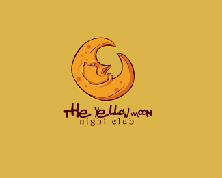
logo proposal for a new nightclub concept, after several attempts we could achieve with the essence of what the customer wanted, who was very satisfied with the results
Status:
Nothing set
Viewed:
9609
Share:

Lets Discuss
That is one hip moon.
ReplyWOOOW MI HERMANO, BESTIAL LA ILSUTRACION, Y EL SISTEMA DE COLOR! ME ENCANTA!
Replythankx a lot my bother Dado, really glad you like it
Replyfriggin awesome! la luna m%E1s loqu%EDsima que he visto! :D**me recuerda la que christina aguilera puso en el cuarto de su beb%E9 :P**excelente trabajo!
ReplyNice overall. My only comment is that the word %22MOON%22 looks a little small in comparison to the words %22THE YELLOW%22. It'd also be nice to have a little more space above %22night club%22, but that's just a personal preference.
Replylove the illustration!
ReplyIt's very refreshing.
Reply%5EI agree with Steve.
Reply%09*ok, thanks for your suggestions.
Reply%09* thanks fogra, Birofunk, sdijock, MomentumMagazine, I %09*I appreciate that
Replylogo for children I think, not for bar
ReplyGizm0, That depends on your point of view and also the concept that you want to transmit, I think it applies perfectly to the purpose for which it was made
ReplyThe illustration is absolutely gorgeous. I want your skills. I have cash.
Replyjejeje, you're joking, thanks Chad Sanderson
ReplySo it is made out of cheese ? Looks like an aged Gouda to me :)
Replyloving the style!
ReplyHey que bien que haya gente que habla espa%F1ol aqui!! Muy buen logo BTW!!
ReplyVery cool concept. My two cents is similar to sdijock's - it looks like %22The%22 is bigger than %22Yellow%22 and yellow is bigger than moon. I would adjust the size a bit.
Replygreat illustration
Replysi javaap aqui hay gente de habla hispana que hace buen trabajo, gracias por tu comentario,
ReplyThis is seriously WOW! FANTASTIC work! While the font for %22night club%22 suits the style of this, it makes the logo look a little bit too much like a kids book illustration. In the context of it being a night club I probably would have tried a modern sans serif all caps font to remind those walking past that it is infact not somewhere for children?%0D*Meh, looks great though!
ReplyThis is great! Love the illustrative style!
Replythankx all you guys, my first featured, bingo
ReplyVery cool, bro, like it a lot. Great style.
Replyinteresting style of illo
Replygreat illustration!
Replygorgeous!
ReplyReally great illustration, lots of character in his face!
Replyawesome!...
Replyi really like the emotion of the moon :D.
ReplyGreat illustration. Nice one.
ReplyNice Illustration, I like how the font compliments the mark :)
ReplyExcellent illustration! Well done! :)
ReplyI like the moon, but the type still needs work. From the direction you're already heading, use a bit more variety in letter size and then tweak the thickness of the type so it all is consistent. Also, it appears that the type isn't centered under the moon. Not sure if it's intentional, but it is distracting for me. Best of luck!
Replynice illustration
Replyinteresting..
Reply%22If the moon was made of cheese would you eat the moon?%22
ReplyGreat stuff!!
Replygreat style - great job :)
Replyreally cool!
Replycool style
ReplyAlways love illustrative logos. This one's brilliant!
ReplyVery prety!
ReplyA stretch at the moment but I am pretty sure that this will get a Club100 status at some point!
Replyvery cool!
ReplyGreat work!!! I like it
ReplyFunky illustration.
Replycooool
Replyawesome :o)
ReplyPlease login/signup to make a comment, registration is easy