Barrabas
by chrisrojo • Uploaded: Sep. 20 '09 - Gallerized: Jun. '11

Float
(Floaters:
81 )
Description:
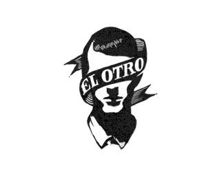
Logotype for a tequila. Another approach.
Status:
Nothing set
Viewed:
9264
Share:
Lets Discuss
The details on the symbol are beautifully done, this looks very good!
ReplyNiiicceee!
Replyvery nice mark illustration
ReplyLove this one Chris, I like this new approach to this industry, I hope they see that, mmmhh Tequila!
Replyvery nice!
ReplyOh, man, sweet.
ReplyThanks for your comments and support guys!
Replygreat men!
ReplyVery nice mark, very interesting! congrats!
Replythis is one helluva piece man.
ReplyThis is cool, man! Like it :)
Replyso simple, love it.
ReplyKarabas-Barabas have a lunch now!*But his Karabas looks good
ReplyFinally in the gallery, I hope they went with one of your concepts, they're all great!
ReplyThanks man! i appreciate your words!
ReplyI have always loved this, Chris, one of my favs.
Replyfinally it got featured!
ReplyHey thanks for your comments guys!
Replyamazing mark , both type and mark fits perfect:)
ReplyI love this mark! Thanks for sharing.
ReplyCool style! Love it!
ReplyGreat style. I can totally picture this etched or embossed on a bottle. Really nice work!
ReplyNice, esta mortal viejo
ReplyPlease login/signup to make a comment, registration is easy